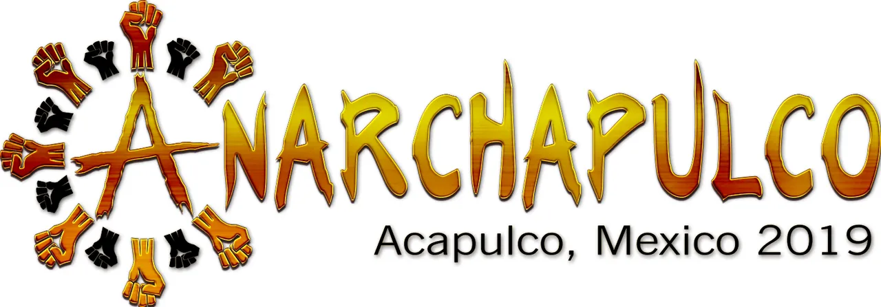
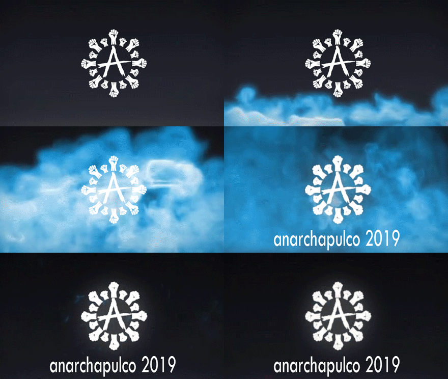
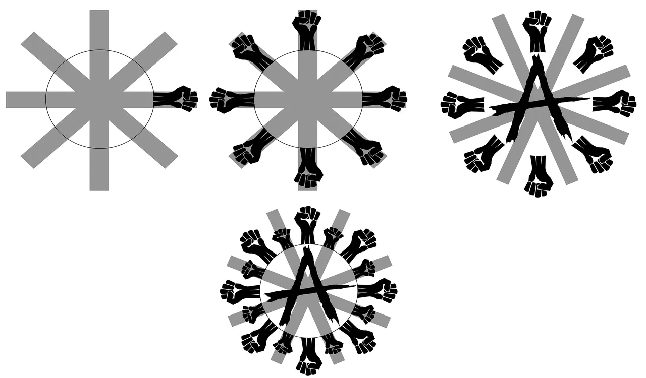
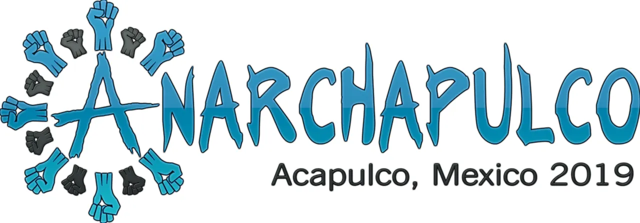
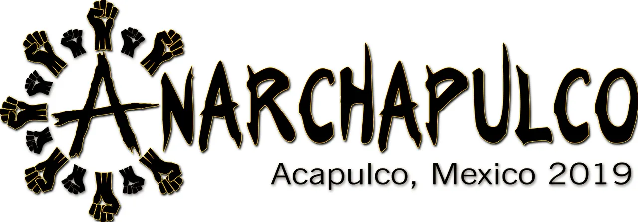
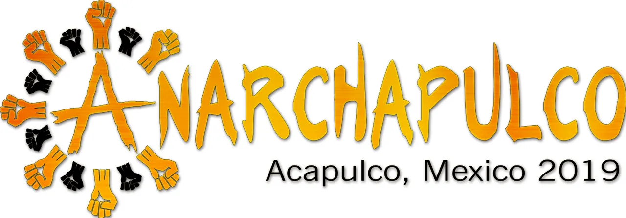
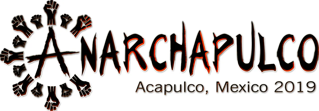
Hello everyone, I made some small adjustments to my logo design for anarchapulco, maybe you not noticed but for my previous design I put the fists on the position of the tips of the original logo which were not symmetrical and I had to readjust my design again.

https://steemitimages.com/0x0/https://ipfs.busy.org/ipfs/QmVqsMN2o423PymHkFCAWmoMbkHvEmzmrrjA4SS6Lws5MM
As you can see, try to make it more symmetrical to be able to completely close the circle that would really make it the anarchapulco logo since it is the symbolism of a meeting of anarchist forces that I really wanted to represent, after several conversations with @elemental and some variations of design he convinced me that the design with the fists alternating their size were the best idea so I only dedicate myself to perfect it a bit.
Also fulfilling some requests of @elamental that I think I have read there, I leave some variations of color as well as the original designs totally in black and at high resolution so that he can make use of them as he wishes.
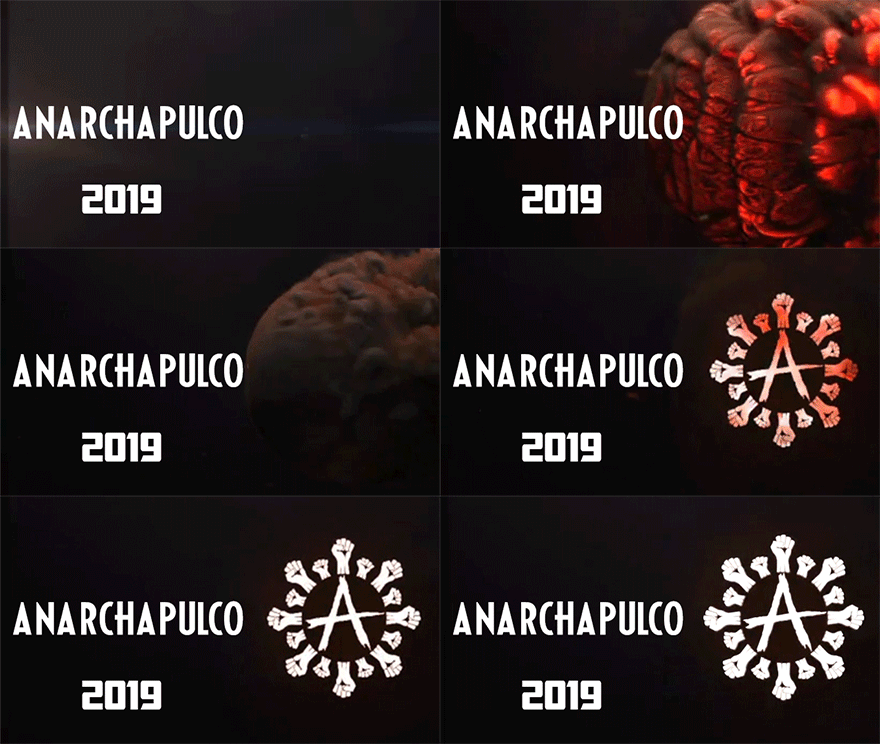
I have returned to the platform after a hard time with a lot of desire to get into new projects and the expectation of what the collaborative project of the @elamental friend has prepared for us, from now on I support your project and I am at your disposal for any idea that it occurs to you to develop.