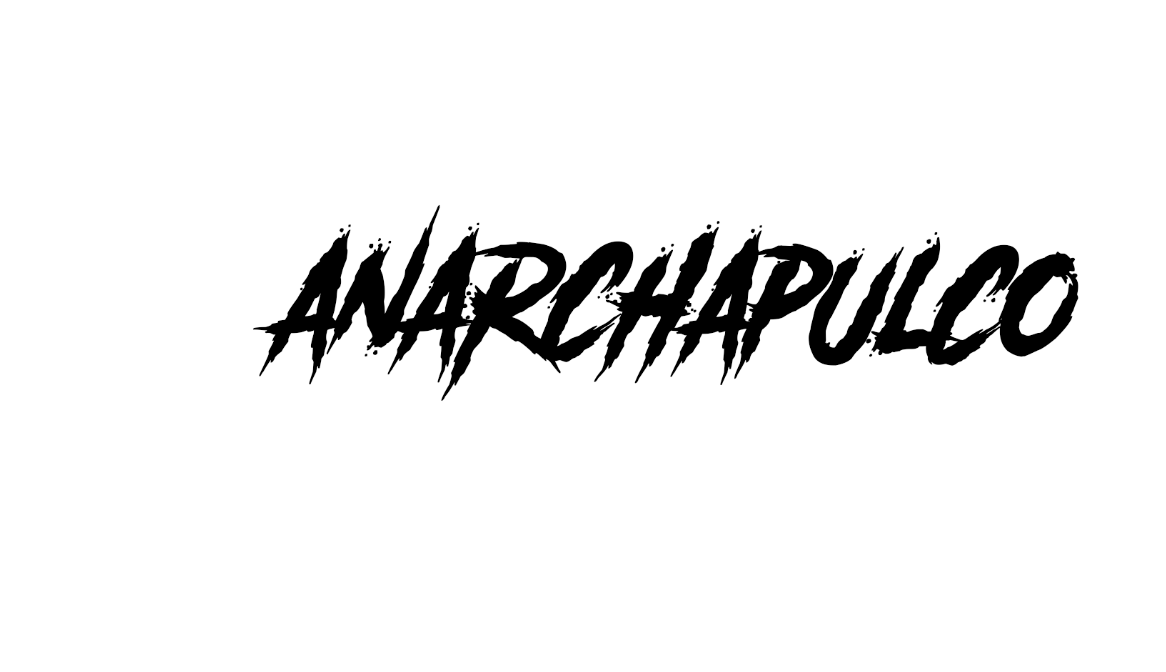
Happy Sunday Steemians, the time has come for the Top Five selections of the #anarchapulco logo design contest. We did not have quite as many participants or entries as we did in the @tribesteemup design contest, however we still were able to manifest some fantastic designs. Some contestants who made the top five participated in the previous contest, and a couple are newcomers that I was glad to see appear. I always love seeing the diversity in talent from artists and graphic designers on this platform. It is one of my favorite aspects of Steemit.
Let's see who made the cut:
This couple is a graphic design dream team that does fantastic work across the board. I really appreciate the amount of forethought and research they put into each design they create. It shows they truly care about the quality and accuracy of their design's intended appeal.
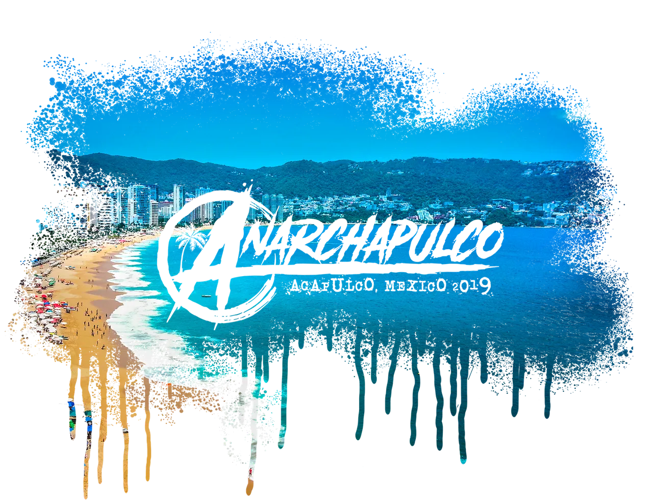
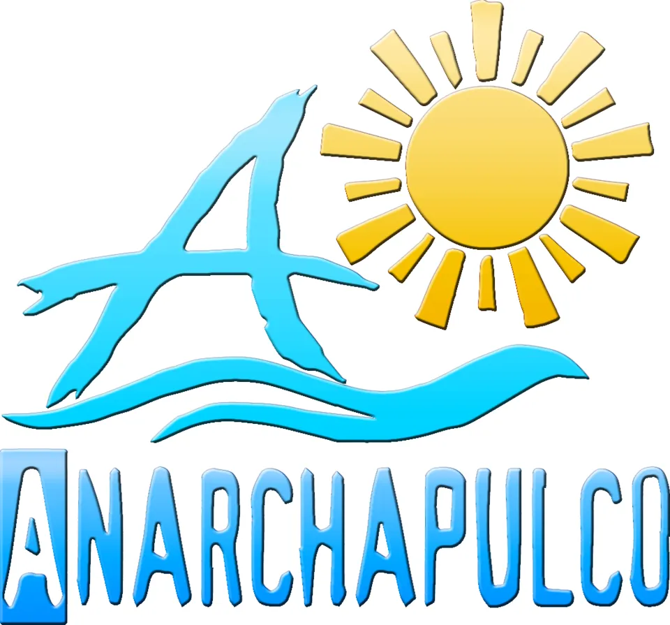
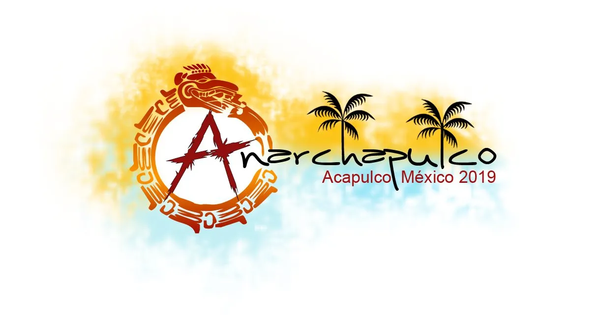
The "painted" version of this logo looks fantastic, and depicts the actual beach that the Princess Hotel in on, where the #anarchapulco conference is being held for the second year in a row. I am working on tracking down who took that photo.
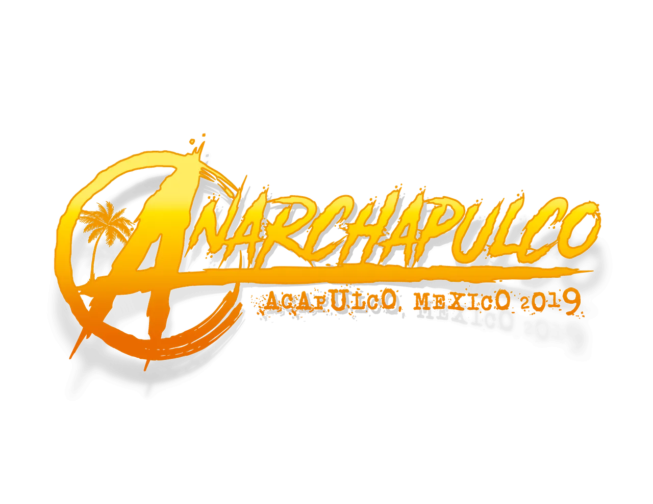
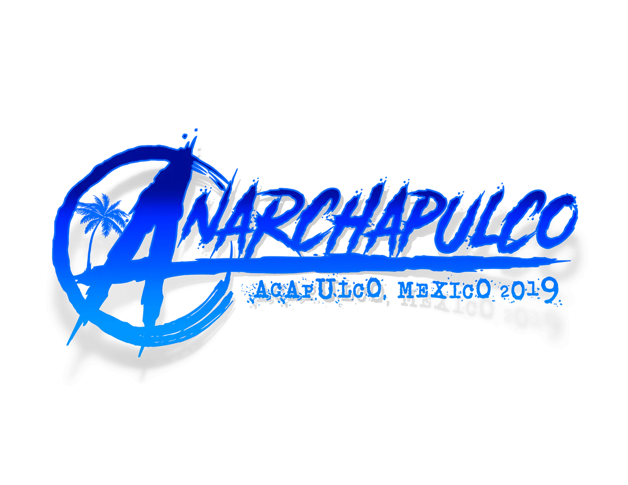
They also made these awesome renditions of the logo. The first one has a sunset vibe to it, and the second has an ocean vibe, both treading in the similar waters, and both appropriate color concept approaches.
@themonkeyzuelans even took it one step further and created a GIF with their version of the logo. I really hope to see this gif evolve a little, grow that palm tree up from the ground, and fade in the "Acapulco, Mexico 2019" text at the end of the graphic as well. That would be saweet! All of @themonkeyzuelan's entries (minus the GIF) are also interactive with night-mode on Steemit. Go ahead and toggle to give it a try.

Just like @themonkeyzuelans, @edxserverus also puts a ton of mind-work in the planning of his design concepts. Watching his @tribesteemup design evolve into a "TribeSteemUp is a Shaman" concept was quite an amazing thing to watch unfold, and I was honored to have been a part of that. His forethought into both parts of my collaborative project have been unparalleled, but I will reveal more about that later. @edxserverus has not been feeling the best lately, and I honestly was not expecting him to participate in this contest as a result. Despite his illness however, he was still able to pump out a couple of bad-ass designs for this contest. I am truly impressed with the strength of his resolve.
I love this rendition of the fists pumping in the air. This is reppin' power to the people, and is a universal symbol for people rising up against tyranny and oppression from governments and other various entities. It is also reminiscent of @mearone's art piece painted live during Anachapulco 2018 (pictured below, not one of @edxserverus' entries).
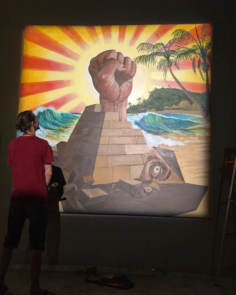
Image Source
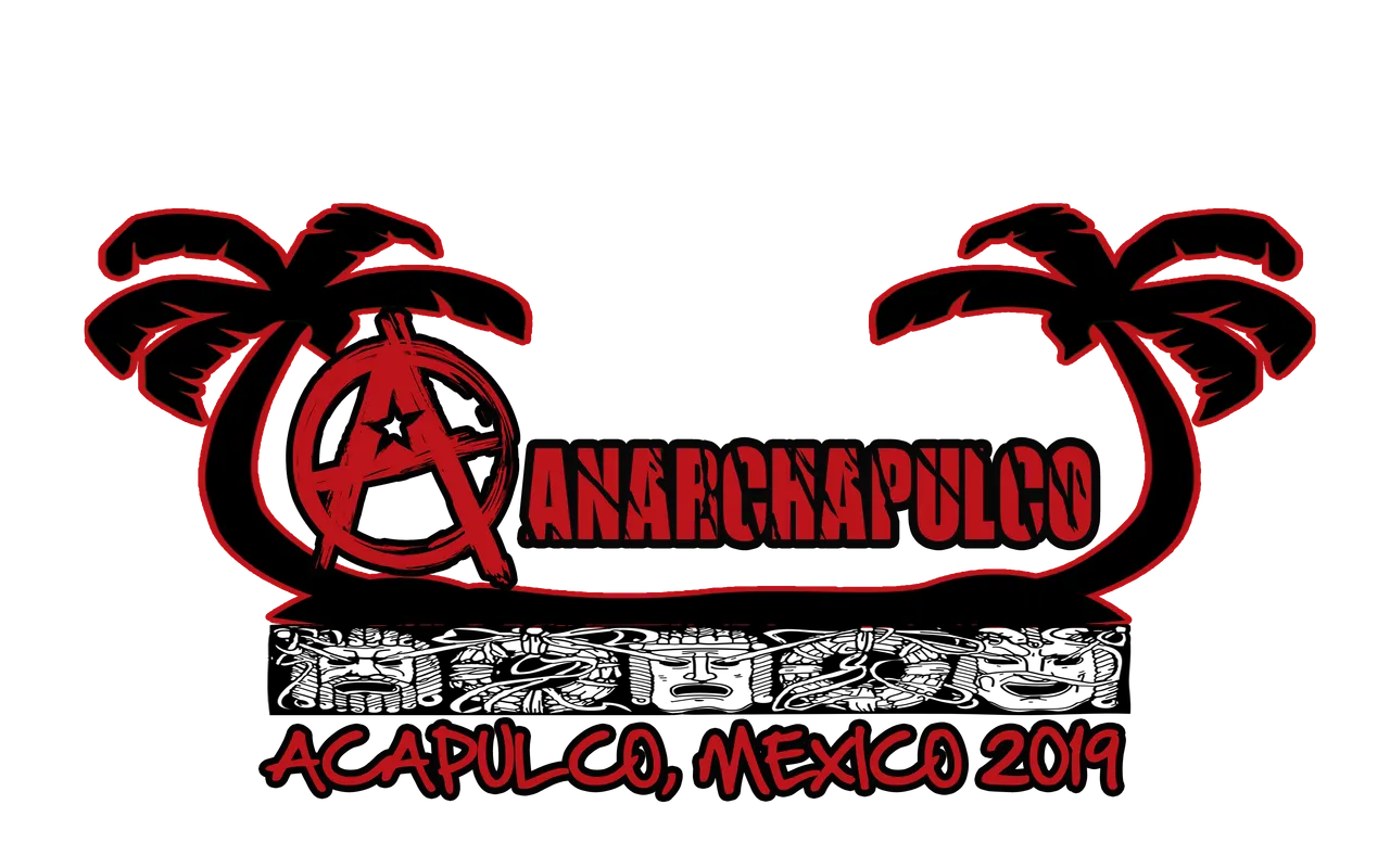
@edxserverus also provided a second entry of Anarchy riding the ocean waves in the sun. Since the conference most aligns with anarcho-capitalism, I would love to see a black and gold version of the fist circle logo to rep that as well.
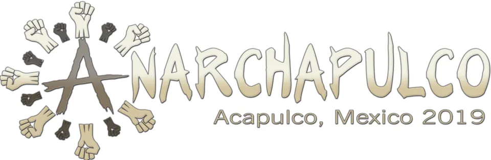
There is no Steemit name I can think of that would be more appropriate for entering this contest than @stateofanarchy! What an awesome synchronicity. @psylanthropist entered into the @tribesteemup contest, but also is helping organize a documentary about Anarchy through his @stateofanarchy account with a few other people.
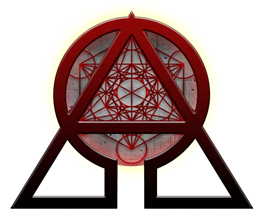
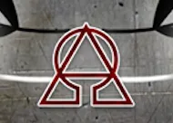
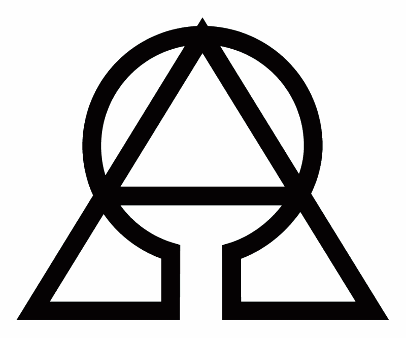
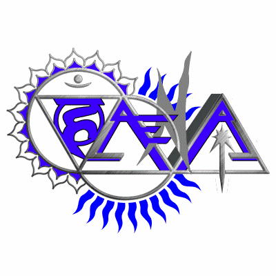
This design concept is absolutely amazing! @stateofanarchy took the symbols for Alpha and Omega, the first and last letters in the Greek alphabet, and also symbolizing a beginning and end, and combined them together to form an extremely unique version of the Anarchy symbol. Combined with some sacred geometry, this logo is headed in a great direction, and I would like to see a couple different banner versions with this symbol as the first letter in "Anarchapulco".
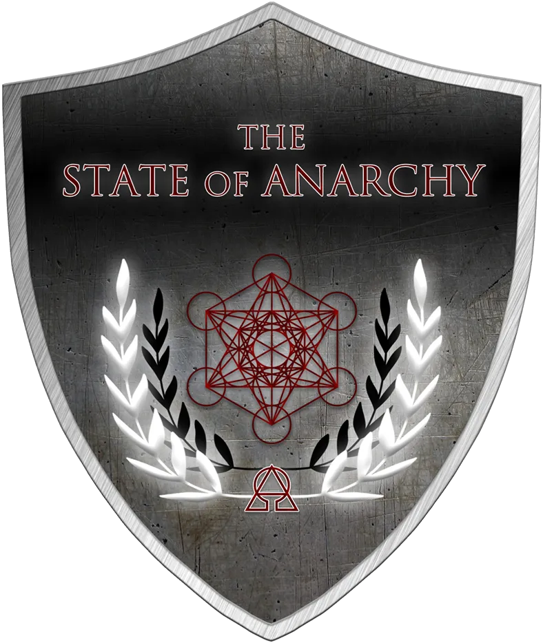
This symbol was derived from a portion of @stateofanarchy's documentary logo (pictured below, not an entry). This logo is quite the eye catcher in itself, and represents something I fully support. We hope to include this logo with the other logos of projects supported by #anarchapulco, in the collaborative art project we are organizing after this contest concludes.
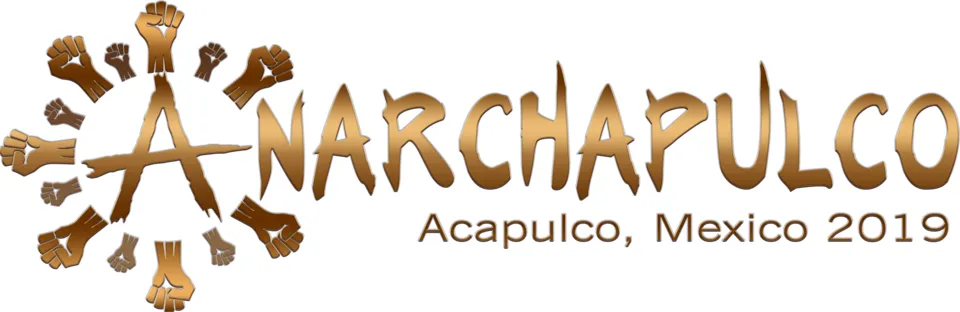
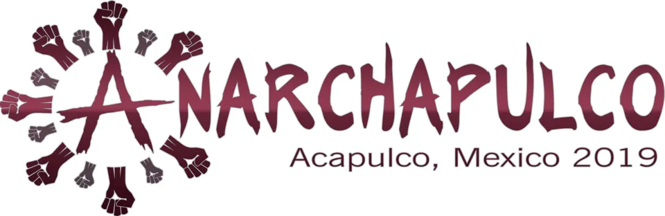
@stateofanarchy produced so many color variants of this custom anarchy symbol, that I decided to take it upon myself to create a GIF image for all his renditions, instead of posting each variant individually. I hope everyone likes it:
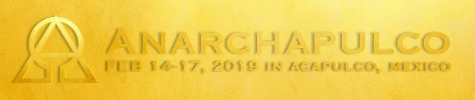
He went with gold for the banner, but I once again would like to see different renditions of this part of his entries, since this one is apparent that the design is for #anarchapulco.
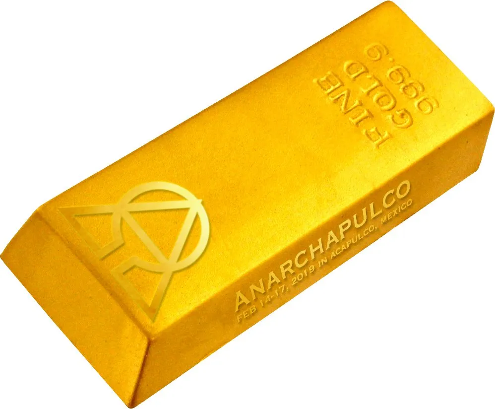
Speaking of gold, I would be jaw dropped to see something like this #anarchapulco .999 pure gold bar (brick) in real life. I am glad he decided to include this as well. That is some serious outside the box thinking, and also totally appropriate.
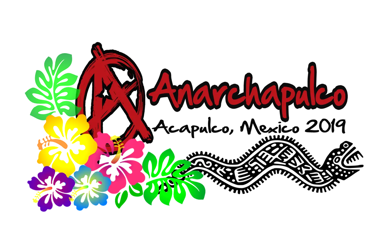
I really appreciated the approach that @edurley took with his entries. He choose to incorporate elements of the local culture and history of Acapulco, Mexico into his designs. This gave his versions of the logo a prevalent tribal appeal that I was looking for. All the contestants here should take a page out of @edurley's book, and strongly consider incorporating this kind of thing into their final design edits. I particularly like his use of Mayan symbolism with the dragon circling the "A" or anarchy symbol.
I like the color scheme best in the top image, and the text font best in the middle image. My favorite rendition of @edurley's designs so far however is his most recent one (pictured below). Turning a couple of the letters into palm trees was a creative idea and aligns with my kind of style. I also like the sponge painted feel to the background on the new one as well. I would recommend that he combines the parts of each of his design variants I have highlighted in this description, into one piece of awesome.
@opiman also chose to incorporate Mayan symbolism into his designs. His first design features masks that were used in ancient Mayan culture to represent various gods that the Mayan people worshiped. His second entry depicts a dragon similar to the one used in @edurley's entries. He also created an Anarchy symbol with a star in the middle of the "A". I like the beachy, yet serious appeal the deep red palm trees give off. It reminds me of a certain kind of sunset where the sun appears much larger than normal on the horizon, and turns your surroundings to a similar deep red.
I personally like the first version better than the second, but am curious which one the community likes better?
On that note, there are three purposes to this article. The first is to display and promote the top five contestants so everyone knows who has advanced. Second, all contestants that have made the top five will now have the option to modify their designs to any degree they see fit moving forward. If a contestant creates an updated design, they may post it here in the comments for review by myself and the community. Which brings me to the third purpose of this article, to take a community poll of what everyone thinks about all of these designs, which one is their favorite, and why.
I am looking forward to hearing what the community has to say about the top five design entries, and excited to see new versions of these already stellar concepts. This is morphing into another successful design contest that will turn into something great. Due to these contests' success, I am sure I will hold more of them in the future when the need arises. I already need logos for at least two other projects I am initiating, but will concentrate on finishing the current ones at hand first.
 |  |
|---|