
I usually hate redoing artwork but sometimes after several years have passed and the open wounds of failure have begun to heal, I get the urge to redo a concept I liked where the execution didn't quite pan out. I've done this before and you can read that post here but it's that time again to take a trip down memory lane to an old piece of artwork that I recently redid.
The Original
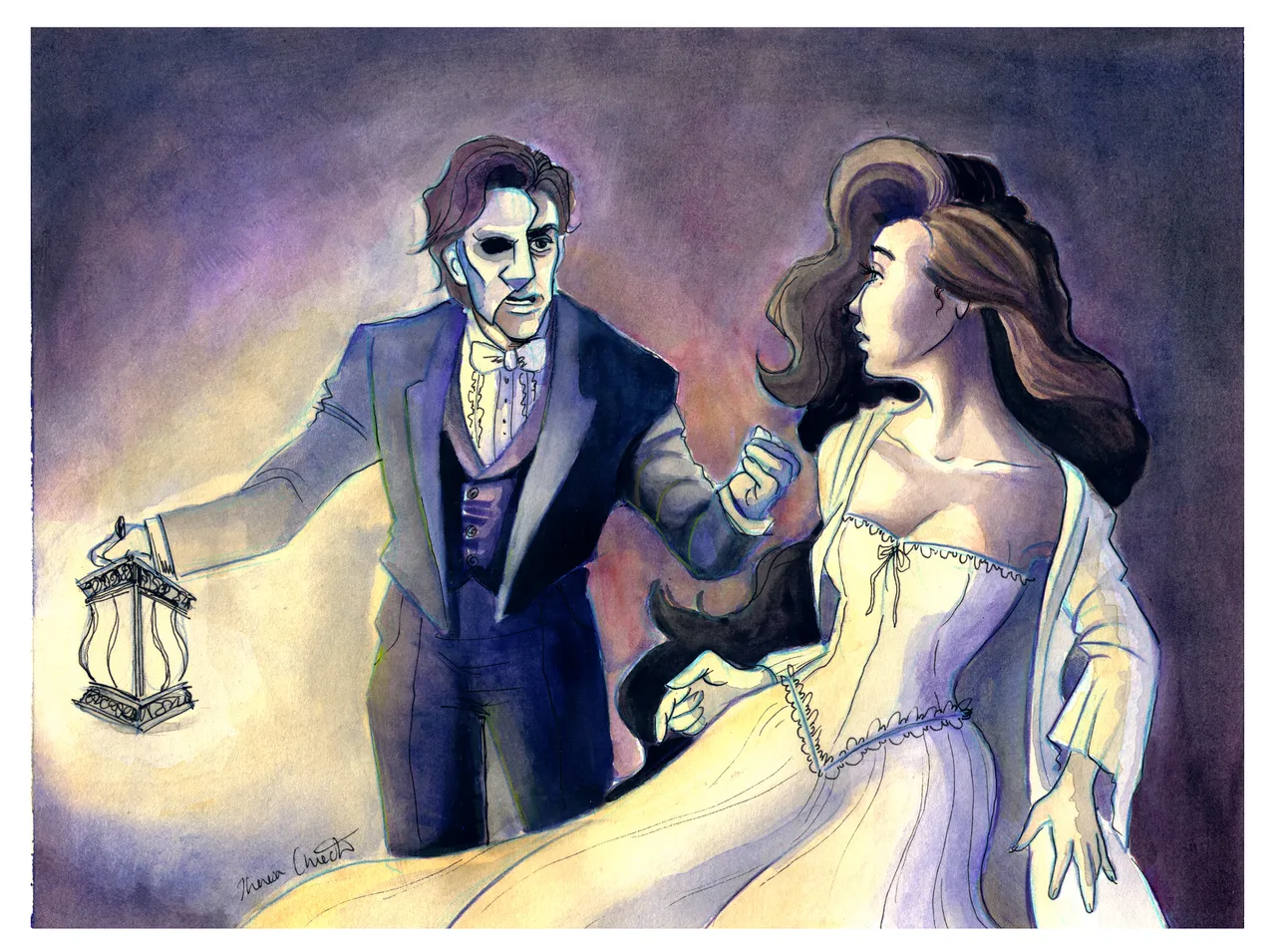
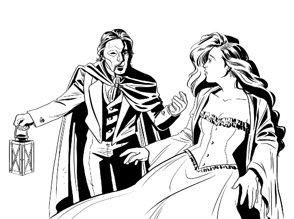
During my "I'm going to make watercolors my bitch" phase, I painted this little number; I was still trying to get a hang of the different types of paper (cold press vs. hot press) and discovering the qualities of certain paint sets (this one was crap, dried like chalk) so while I really liked the pose of this piece, the process was quite frustrating and I was not pleased with the end result.
So the other week, I opened up Photoshop and decided to take another crack at it.
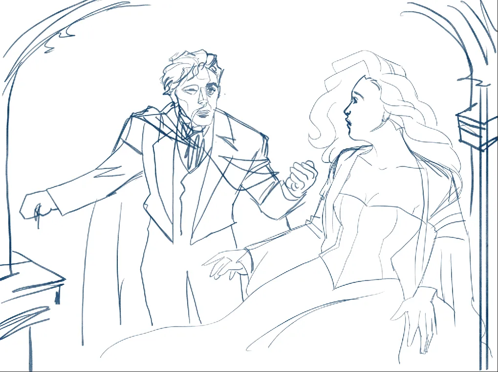
I came up with this quick sketch, making sure to fix the anatomy/proportions from the original. At this point, I knew I wanted to have a background in this piece but wasn't sure what I wanted it to look like. I'm a "cross that bridge when we get there" kind of girl, so I threw in a quick suggestion of some arches and called it a day.
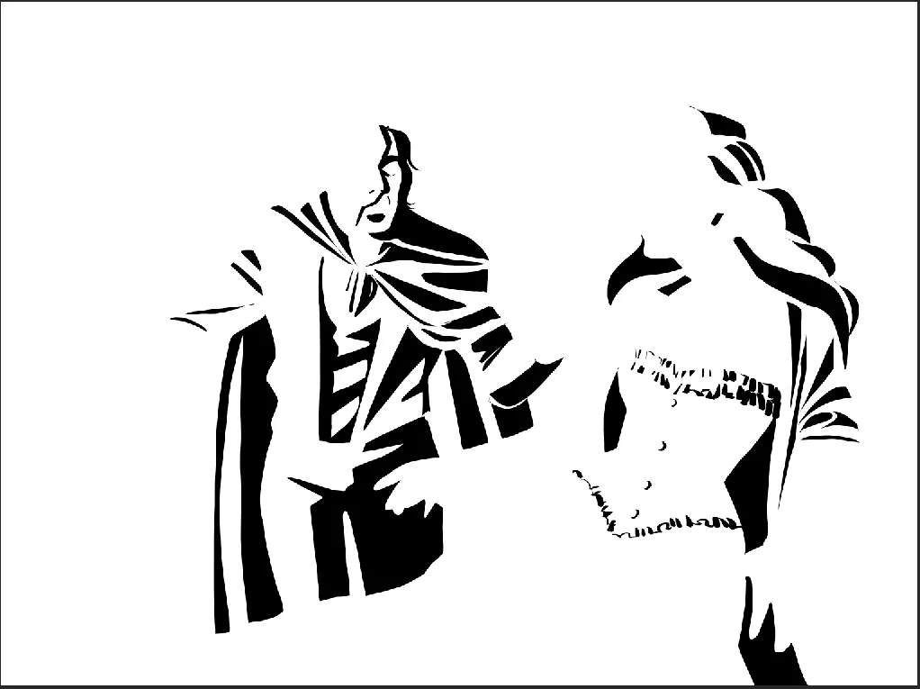
My newest technique is to spot the blacks first and then go back in with the detail; you can read about that here. In my quest to become Alex Toth/Mike Mignola I discovered the technique and I feel it really helps to establish a light source and give that graphic feel that I love. Plus I think it always just looks super cool at this stage.
This is the illustration all inked and ready for color. Still no definite background but we're trucking along.
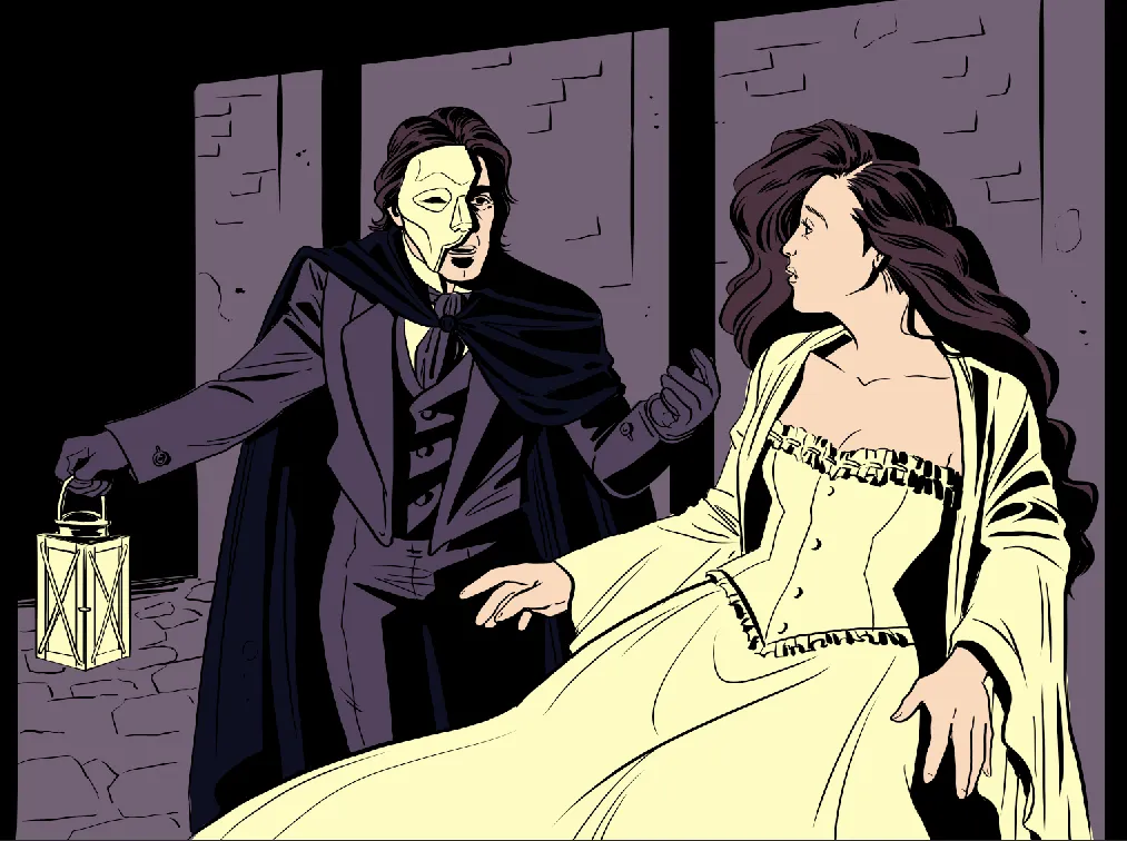
Next, I flatted the colors and OH look at that! Some background! Still trying to be like my man, Mike Mignola, I was attempting to go for more of the suggestion of a hallway than a fully rendered out background. Was it successful? ...Eh?
I still wanted to keep the look and texture of the watercolor piece, so I experimented with some ink wash/watercolor photoshop brushes and came to this. At this point, I was in my "Wow, this looks like shit and I hate it but I've invested too much time into this to give up," phase of the process and asked my boyfriend for his opinion.
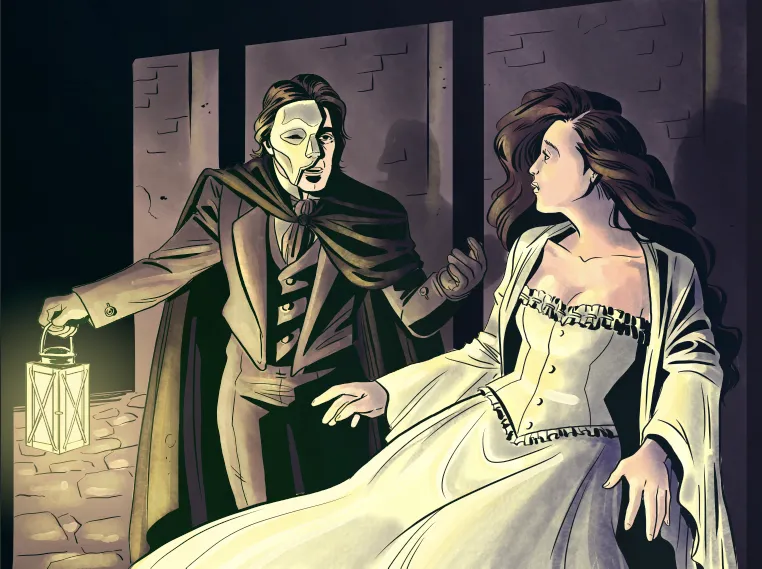
He told me to push the shadows even more considering the lantern is the only source of light, so I went back in to noodle around some more with the lineart. But something was still off. After a bit of back and forth we realized the background was just not working.
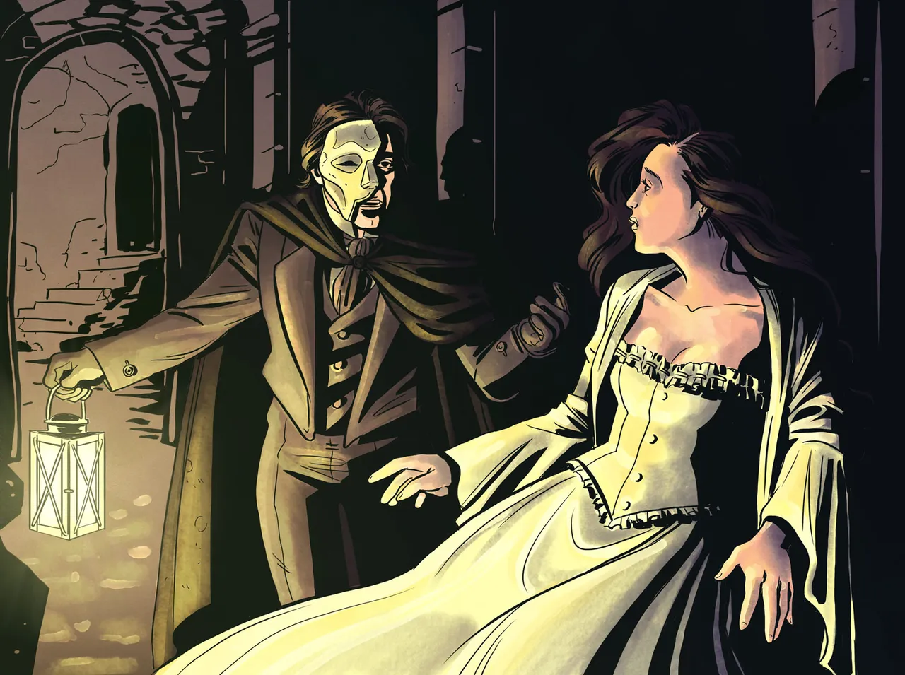
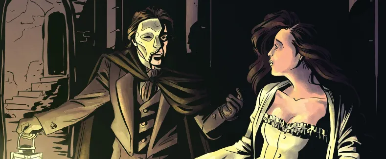
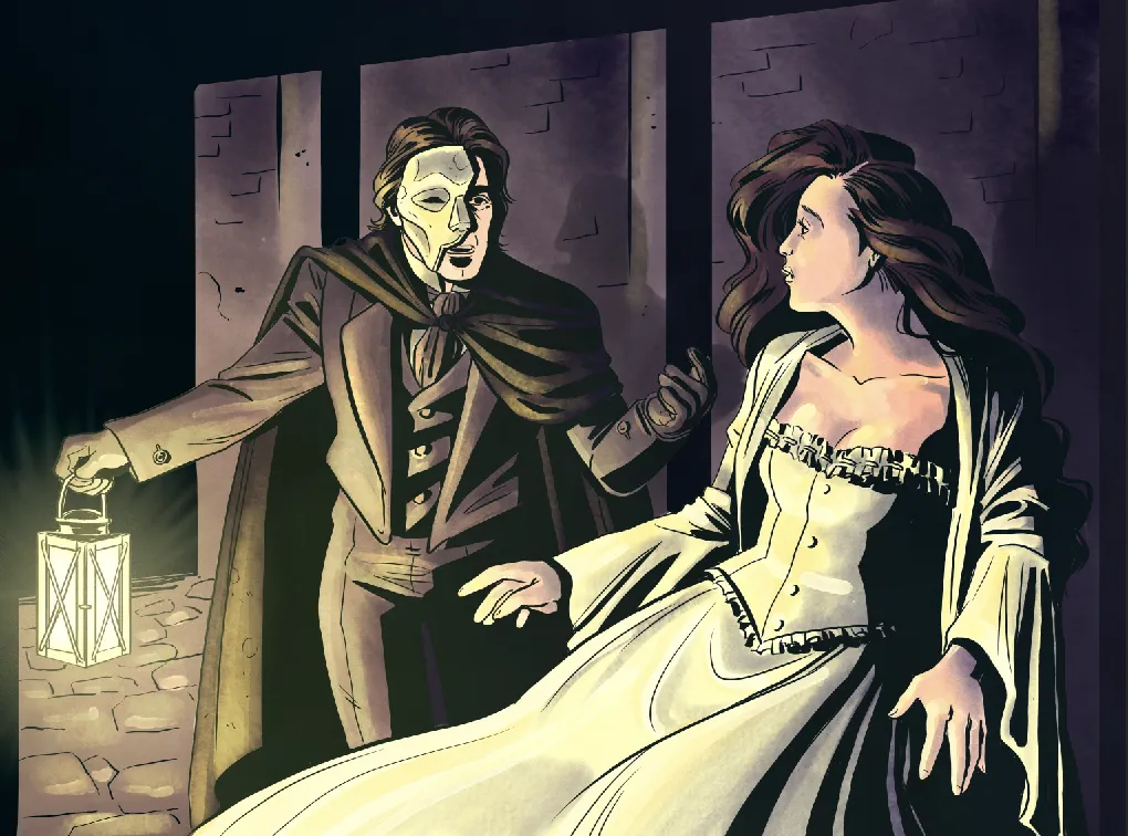
So after one last battle with the background, I ended up with this number. And this is the final look!
I think it's a definite improvement from the original and I'm happy to put the whole thing to rest.

If you'd like to keep up with more of my work you can check me out at the following:
Instagram: @la.fumettista
Tumblr: http://la-fumettista.tumblr.com/tagged/art
Twitter: @TheresaChiechi
Website: https://www.theresachiechi.com/