
Some questions to ask before we proceed :
- How much does sketching before coloring help ?...Does it at all ?
- What if the sketch just gets hidden behind your primary coat of paint?
- Are we afraid of white spaces that get left around objects due to our fear of accidentally smudging the colors on the boundaries of our sketch ?
INTRODUCTION :
This technique is one of the most IMPORTANT techniques one learns while transitioning from an amateur to a semi-professional artist. It is all about getting rid of the childish sketch and paint technique, and depend upon the brush or the color itself for everything.
This technique is NOT endemic to poster colors, but can be used almost with every medium, except pencil colors. This is mainly because pencil colors are so smooth, thin(as in the thickness of the color layer applied), crisp and hard(hardness of the pencil lead as compared to Oil Pastels) which doesn't allow them to be effectively used to paint in layers.
STEP -# 0.0
If one is not a beginner and can sketch "fairly well", then using the brush as your pencil might be a good idea !
IMPORTANT : "Fairly well" means that one should be able to draw figures and objects in a single stroke i.e. without lifting the pencil.
STEP -# 0.1
Once STEP -# 0.0 has been practiced and can be done confidently, just switch the pencil with a lightly loaded thin brush of wet paint. This transition shouldn't be much of a problem after trying a few times.
Just take care of the tip of the brush, it is more flexible than the rigid pencil lead, it bends and "recoils"....so to say !!
STEP -# 0.2
Tone-up your imagination and get rid of the eraser !
Painting is all about imagination. But, even after having a fair imagination power, and a good sketching capability, some people tend to use the eraser repeatedly - shifting objects from one position to another on the canvas.
Well, with the brush one wouldn't be able to erase things off the canvas easily, so it's better to exercise and strengthen your imagination and be very careful.
Now that we are all primed for the technique, let's plunge into it right away ! The rest is all very easy !!
Let's take one of my old paintings as our guinea pig, and learn from it whatever we can...!
STEP -# 1.0
Apply a basic coat of the color to give a sense of depth. This should be a simple smudge, and mix-up of patches of background color(i.e put wet patches of rich color for ex. light blue for sky, light green for grass, and mix them all at the boundaries with each-other using white color - if you are using poster colors).
The image below should give you a rough idea...
Now, let it dry completely.
Quick Note -
- Use straight, long and parallel strokes of brush. The individual strokes or the color boundaries shouldn't be visible.
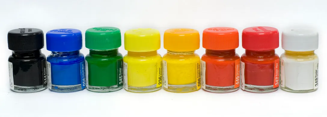
- Keep lots of extra white color in store. This will be the color you'll be eating up the most !!
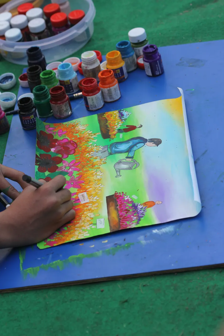
[© Martin Medro || Image-1 : The background coat has been applied and second layer(detailing) is being applied ]
STEP -# 2.0
Now, carefully start adding the foreground detailing using the brush and paint itself.
NOTE :
- You no longer need to worry about white spaces left here and there all over the painting...
- Just enjoy the beauty of the technique...!
Please avoid using pencil as much as possible. It'll only destroy your painting, as, well as your skills.
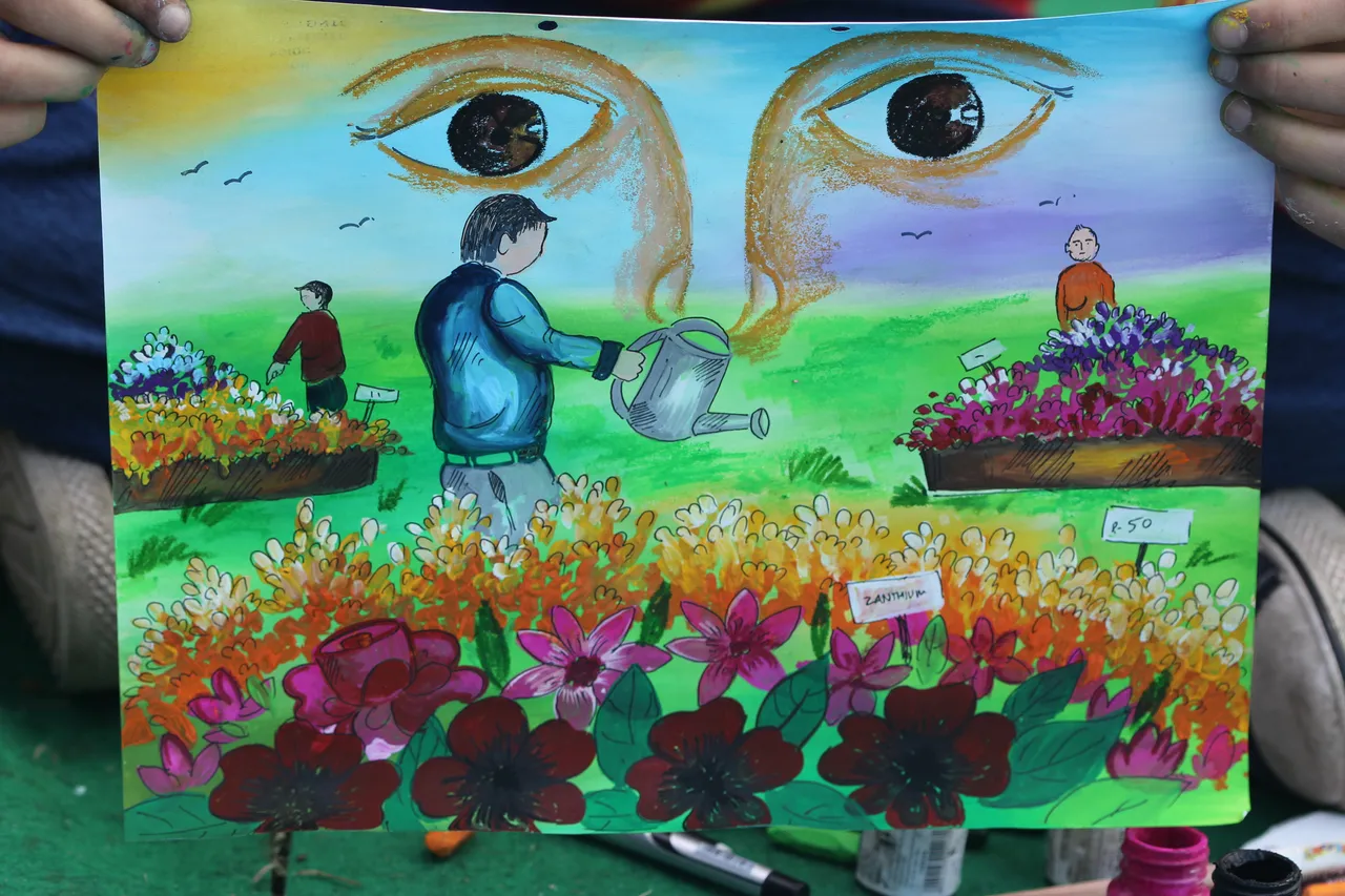
[© Martin Medro || Image-2 : The detailing is almost complete. Highlighting in progress... ]
STEP -# 3.0
- Highlight important objects.
- Fill up negative spaces.
- Add finishing touches.
STEP -# 4.0
Be Patient !, Enjoy the process, NOT the result.
Everything may not always go perfectly well, especially when you are still practicing...as you can see below...
[© Martin Medro || Image-3 : The detailing is almost complete. Highlighting in progress... ]
STEP -# 5.0
- Analyze your artwork...
- Learn from your mistakes. The faster you rectify your mistakes, the better it will be...
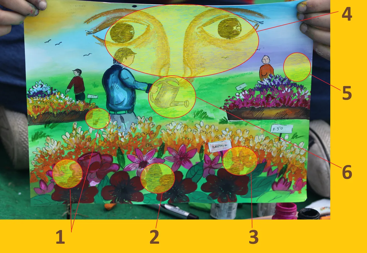
[© Martin Medro || Image-4 : Analyzing our mistakes... ]
Mistakes
- Blank spaces still remain because of incorrect choice of background color. In our case, we have chosen such a light color which is just failing to help camouflage the details applied onto it.
- Flat colouring - Avoid colouring objects flatly, utilise your knowledge of light-and-shade as much as possible to make the picture look realistic.
- Unrealistic depiction - "A flower should not look like a star !!"
- Poor depiction due to lack of mental-preparedness - Don't throw-in irrelevant objects for the sake of covering space, rather cover space because you need an object.
- Negative Spaces -Never leave oddly blank spaces(negative-spaces) which hurt the eye.
- Avoid Shortcuts - A brush should never be substituted with a pen or a sketch-pen, even if the detailing is fine.
STEP -# 6.0
Never Say Die...Keep Practicing...
Here is one more of my old paintings for you to have a better idea of the technique...

[© Martin Medro || Image-5 : A Sample for you to analyze and exercise your gray matter...! ]
There are a lot of mistakes in this painting as well...
Try finding the mistakes in the painting above, and let me know !!
Thanks for your time and patience.
Keep Steeming !
M. Medro