

This is part of an ongoing series about how I make my comic about Phill from GCHQ. If you are interested in reading the actual comic you can find it here (it's still a work in progress but at page 35):
https://phillfromgchq.co.uk
And the earlier chapters of this series can be read here:
Introduction
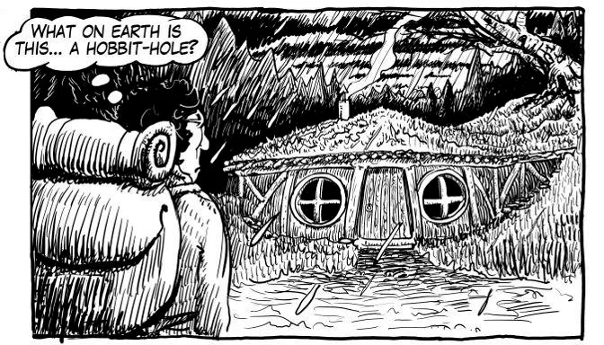
In semiotics there have been a lot of work that tries to create models that minimizes a narrative to its atom - one model could be this: The hero goes out in the world, solve a problem, gains some vital experiences, and returns home. This one is probably going to fit the story about Phill from GCHQ quite well! It also fits the Hobbit and the epic of Gilgamesh and Star Wars...
But there is of course more to it. Sometimes you will read a story just for the beautiful language - even though there is much more to his art Gabriel García Márquez is such a writer - sometimes you will be intrigued by the strange and wonderful world depicted - like in Frank Herbert's Dune - and in comics you have: the drawings.
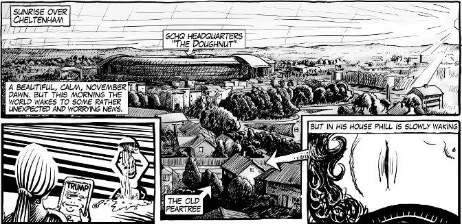
The background and when to use it
One of the cartoonists I have learned most from is Hugo Pratt. His stories are vague and dreamlike, and the drawings are marvellous - especially the albums he made in the seventies. One of the thing he was good at was minimizing the backgrounds without loosing the sense of location... that is... in his later works he seemed to get tired of drawing and more interested in his strange esoteric stories, but that is a bit besides the point here.
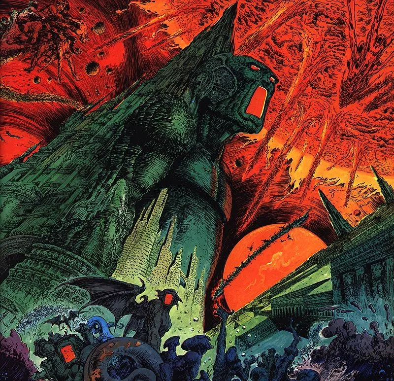
On the other hand. Landscapes can be great images to draw, and interesting for the reader. Just take a look at this marvellous detail from Yragael Urm by Phillipe Druillet.
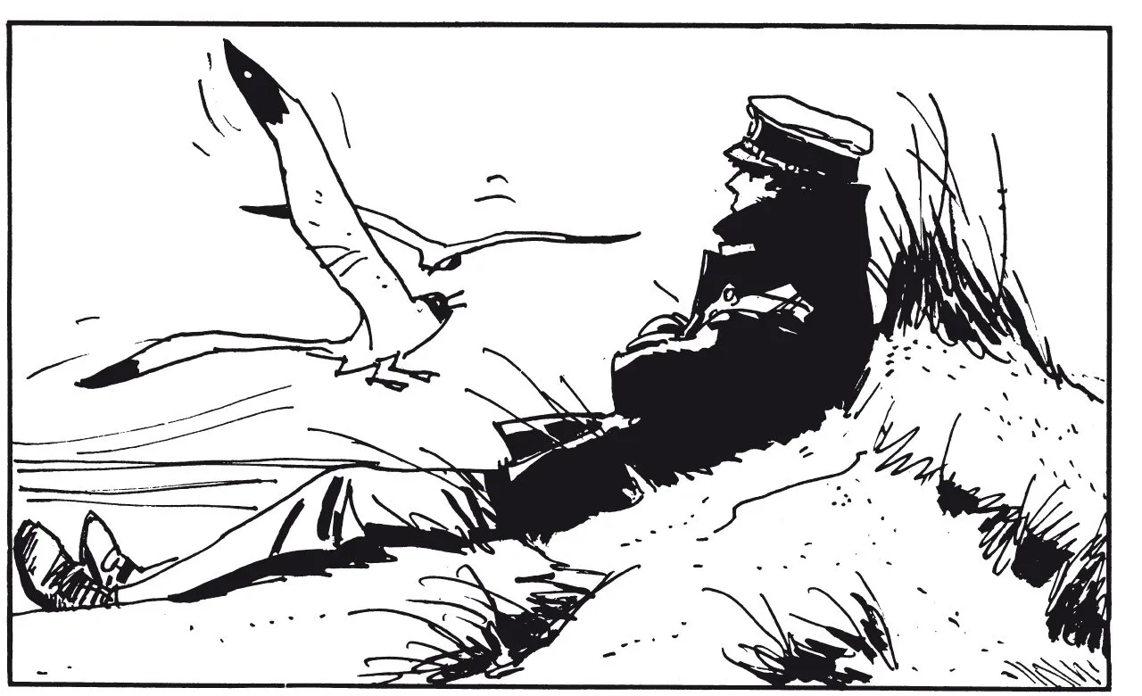
But there is one important rule I use when I work: don't do both complex backgrounds and characters studies at the same time. I take it in steps, the comic strip is build for exactly that. Look at this sequence.
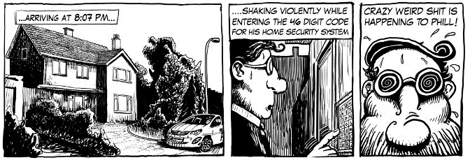
I try to only show as much as necessary while remembering that the reader never should forget where the story is happening.
Helping tools
So how so you go about making these backgrounds? it can be one of the most demanding and time consuming tasks when making a comic.
Depth
The most obvious answer is of course... draw it. But to draw a landscape you need to know a bit about how to achieve depth in an image. The first one is very simple... big things are near and small things are far away.
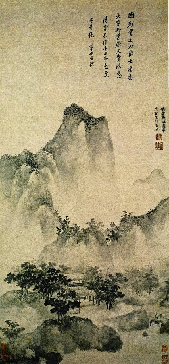
Then there is the set-piece approach. The Chinese painters never developed a true perspective but got along with having overlapping mountains where the ground in between was often covered in fog. An elegant approach that is easy to use.

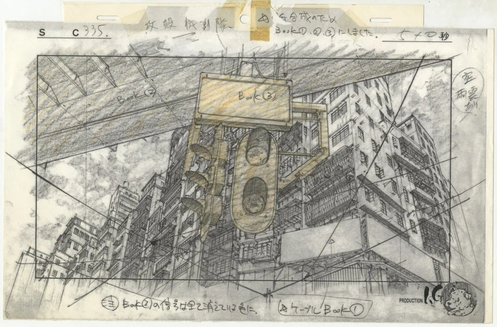
Then there is of course real perspective, a time consuming and meticulous task that I mostly avoid :) Below you can see a drawing used for the background of the fantastic 1995 anime Ghost in the Shell.
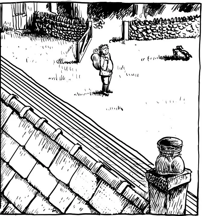
But there are many small things that can create depth. I have been teaching painting, and one of the things that was hardest to understand for the students was how differences can create depth - mostly line width, light and darkness and cold/warm colours- and how the they can be reversed. Light in the foreground and dark in the background, but also the complete opposite. The human eye understand many things in contrasts. Below you can see an examples.
From image sources
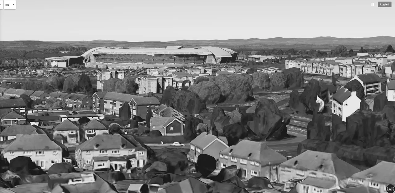
Another much easier approach is to simply take a photo and put is on the light-table or into the computer. There is not that much to be said about it, but instead I can reveal a simple but clever trick, namely using the fabulous Google Maps to find specific aerial views.
3D graphics
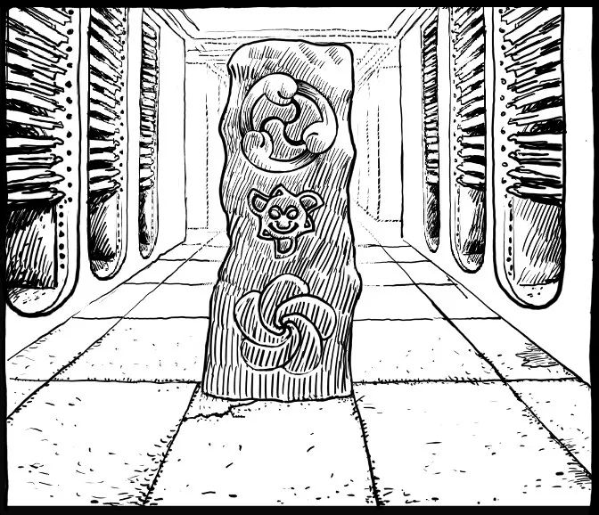
The third way of doing it is to use models, and with the invention of 3d-graphics it is something that is becoming more popular. I have used it in the past, but not for the Phill from GCHQ-comic. So instead I have borrowed some screen-dumps and a traced image from @platonicsironic, a young comic-artist here on Steemit that you ought to check out.
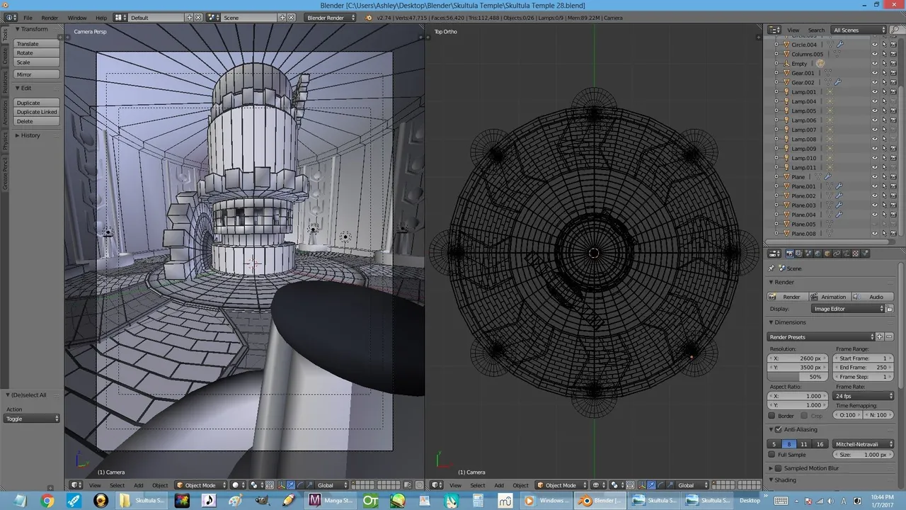

My experience with using this technique is that the simpler the geometry the better. Windows and other details should be added in free hand to give a less stiff look. So just using boxes and other simple geometry is more than enough, and it also makes the work-flow much faster.
Other uses for the background
It is important to show where the scene is taking place, but the backgrounds are of course used for many other things too. Not least giving the comic some atmosphere!


I have for this post lend images from the following sites:
http://culturebox.francetvinfo.fr/
http://cosmology.com (where you can discover is God is an alien!)
https://zothiqueelultimocontinente.wordpress.com
Wikipedia
http://www.altertuemliches.at
And thanks to @platonicsironic for letting me use the Blender-screenshot and the trace. Go check out the blog!