Hi Steem people!
I've posted a submission to the design a character contest by @w0olf. I did last week's challange, which was design a character from a given color pallete, and this week's challange is to re-design a known character of choise in a new style and concept.
link to contest page: @w0olf/design-a-character-contest-week-3-reimagine-challenge-win-sbd#@uv10/re-w0olf-design-a-character-contest-week-3-reimagine-challenge-win-sbd-20180107t173646242z
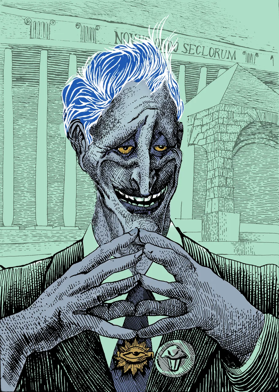
I've picked the character of Hades- god of the underworld from the Disney film "Hercules".
I havan't watched the film in a very long time, and I vaguely remember it but I like the way Hades is very well designed to be a villain character in my opinion.
The association that came to my mind when I though about him was of a powerful, but cynical and evil man. one that is a little bit camp, and has the evil smile of a sociopath. kind of like the sociopath class that has a tightening hold over our political world. basically- a power player in a suit, that sports power symbols like the skull fibula that the original Hades has on his tunic- he could be a buisinessman, lawyer or a politician.
I will present a very concise breakdown of the drawing. since I have'nt recorded anything and had very little in the way of planning. so I kinda rolled with it. but I've chosen to do it in a technique that I'm very fond of. here it is:
I'm using a 0.5mm tip rapidograph from Sakura:

this image is copyrighted, source
My crosshatching style is ancient and corresponds with printmakers's drawing process.
I layer my grayscale in simple crosshatch patterns. each pattern is a simdgen darker than the other, and when I combine them I get varrying levels of darkness. I can blend between patterns to get value gradients and control the "expantion" of value spots on the paper. this is a fun but tedious activity, which is very calming and A.D.D freindly :)
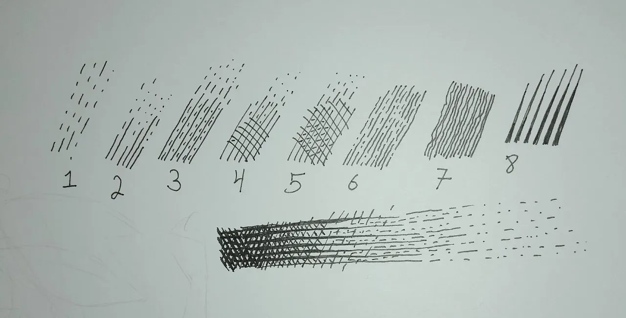
The trick is using the brain inclination to see abstract color fields before individual details. so for example, lines that are closer form darker value. none of the crosshatch marks are perfectly straigt, whitch is good - I couldn't draw a straight edge even if I tried- but once again the brain sees lines going in slighly different direction and tries to "correct" the deviation. also, most surfaces in nature are curved, so the lines need to follow the cross-contour of the volume they shade.
Also, notice that white lines in a solid black field tend to stand out. thicker lines= darker tone. and randomly dotted lines are great for flat surfaces or dissoving shadows- because the brain seek uniformity, and when faced with random jittery lines it tend to generelize them into a larger shape. the squiggly lines are even better to convey an empty area like a sky. In reality, nothing is "empty", not even the vacuum of space! (don't ask me to explain, I've obviously watched to many science documentaries on Youtube without studying physics).
Why, and this is a question I've asked myself a couple of times, use this fancy crosshatching technique instead of slapping on some photoshop gradients? in the printmaking days the answer was the limited amount of colors available for use in a print. by why now?
because the uniformity of crosshatchings and points and squiggles along the entire image ties the all the elements >together, and helps to create a sense of realism even in subjects that are vastly unrealistic.
Here are some steps:
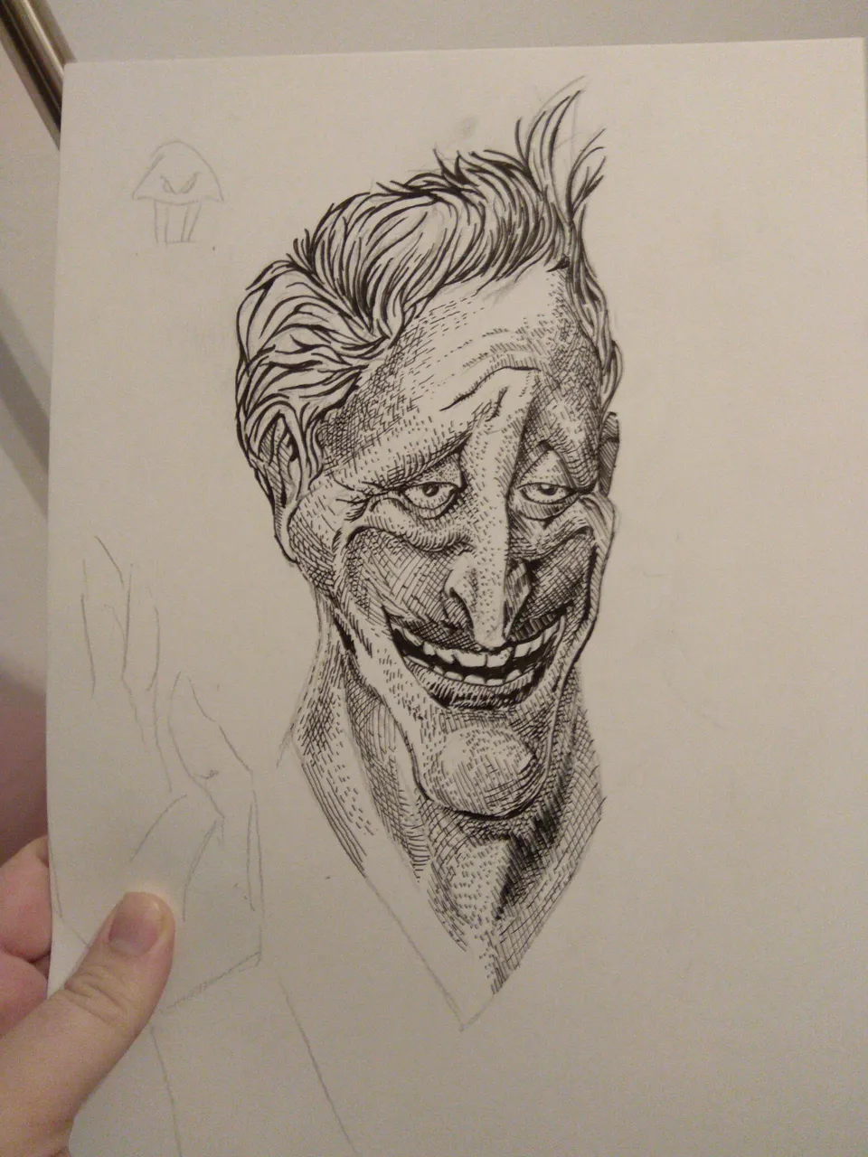
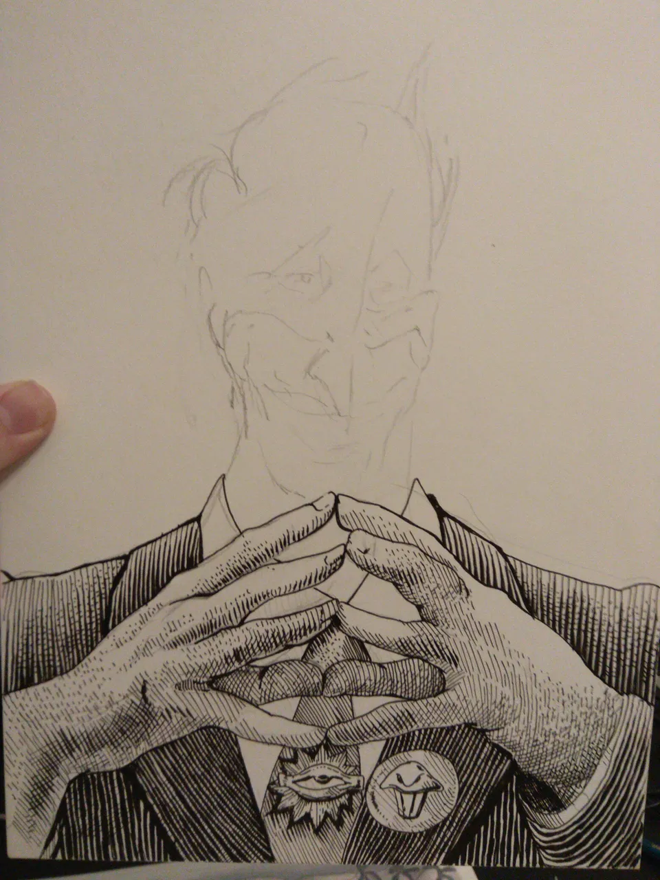
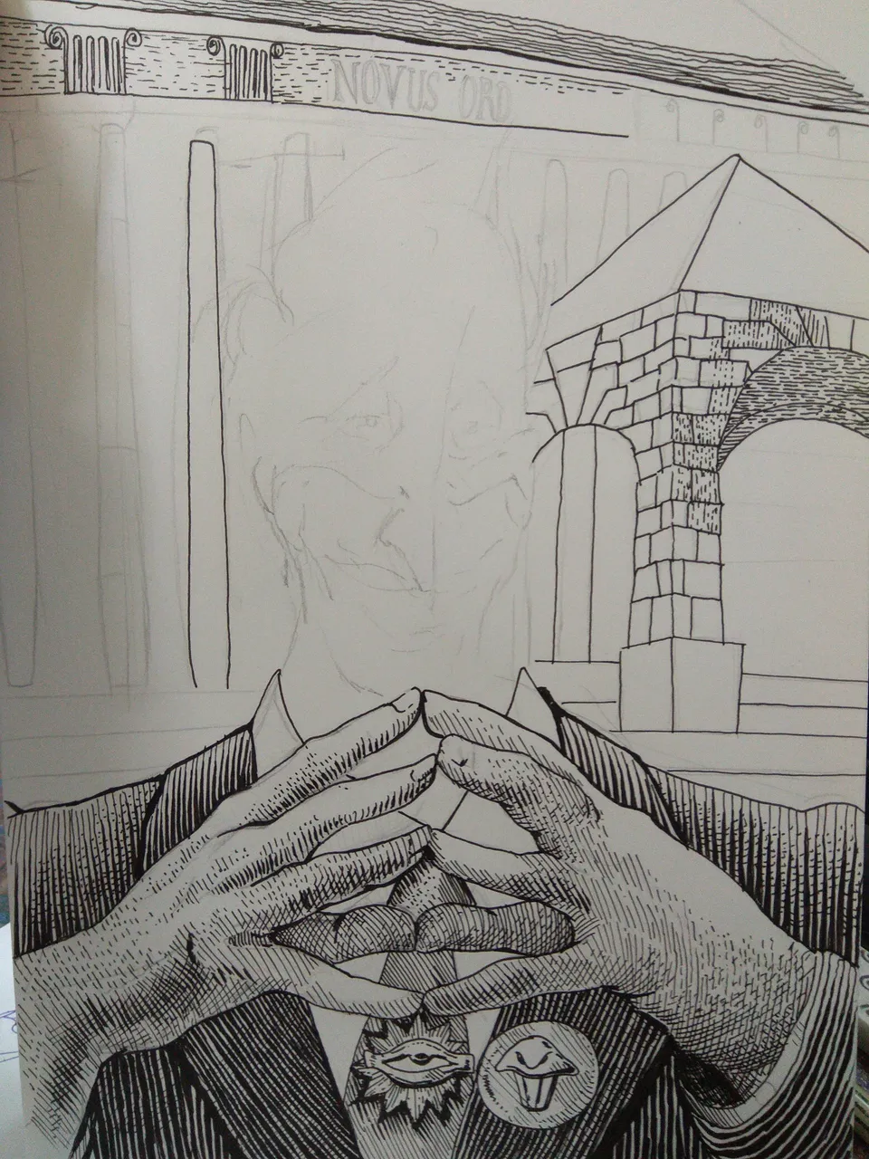
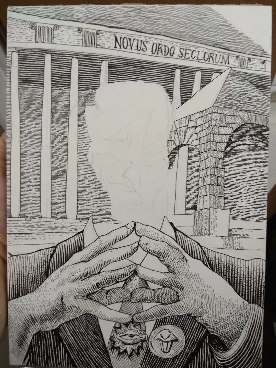
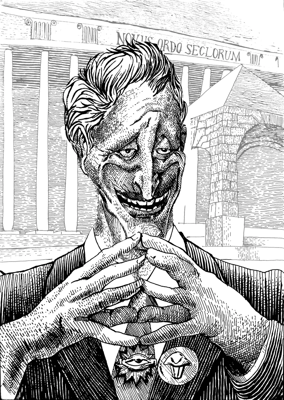
Here is my layers setup
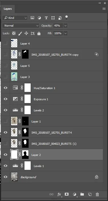
I've combined the head and the body+background and masked the head to fit the body. I've put on a layer of coloring with opacity mode set to "multiply", then another one just for the head. on it I've painted some spots in a slightly warmer lighter color, and blended them together. I've then duplicated the head layer, masked off everything but the hair and went to layer option- where I clipped out the white. I then inverted the colors of the layer, to make the hair contours be white instead of black.
I hope you enjoyed this post. thank you very much for your patience and attention!
Have a good week!