
Cutting out an element of a picture for use in a digital composition of any kind is an often reoccurring challenge when creating graphics. Today I've challenged myself to do one of the more difficult cutouts: a portrait set against a "difficult" background.
Not perfect by any means, but I'm happy with this for a first try!
A few posts back I promised to myself that I'm Going To Learn GIMP after having had the luxury of using Adobe Photoshop for years... years ago. Looking for an alternative, GIMP seemed the obvious choice: it's free and it has the most important features that make Photoshop such a powerful image editing software. The ability to use layers, masks and transparency are basically all you need to create astonishing effects.
Something we often want to achieve, is to make a cutout of an element from a picture, so we can place that element against an alternative background and / or use it in a digital composition. There are many techniques to do this and the one you choose is heavily dependent on what you want to cut out, and if the background is a uniform color, a gradient or just an intricate mess of colors and shapes.
You would choose the path tool to outline the desired object if it consists of a mixture of straight and curved lines, like a car or a building: after a little bit of practice with the tool it's rather easy to achieve highly precise cutouts with this technique. Shapes, objects and even persons or animals that are set against a uniformly colored background are also a relatively easy thing to remove from the picture. Just select the background color with the "magic wand" tool, inverse the selection and presto; you're ready to cut and paste.
But I decided to go straight for the most difficult scenario: an portrait with many strands of hair, set against a background that has heavy light and dark variations, and a lot of light of the same color as the background shining through the hair... Now, let me say straight away, looking at this challenge it's best to immediately admit the job will never be perfect; the aim here is to make it believable and looking as realistic as possible.
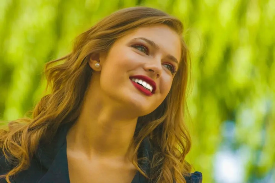
The original picture; this will be a challenge to cut out...
Source: Pixnio
I'm not a professional, and I'm just starting out with GIMP. Also I have literally no time left in may day to day schedule, which is why I combine my promise to myself with my promise to you, dear reader, to publish a post every day. So I hope some of you will find this interesting, and maybe be inspired to start creating real art with the free GIMP software.
We start with this picture of a girl set against an out of focus background with bright and darker greens, some light blue and white. At the fringes this background alternates between blending in with the hair and contrasting the hair; this is why we know in advance that the cutout will be an approximation rather that an exact one. And even if the end result isn't perfect by any means, it's my first attempt at this in GIMP after all, it took me several hours to complete. When I get more experience with this software and the method I used, I think an image like this will take about one hour to cut out; it's rather much work, so please let me know if any of you know of a better method.
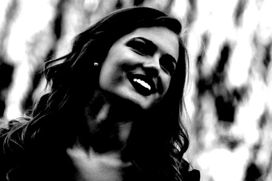
What we need to do, in this amateur's eyes, is to create a maximum amount of contrast between the object and the background. Now, just looking at the photo we see that the girl is, overall, a bit darker than the green background. Step one is to duplicate the layer, so we can work non-destructively and can always start anew from the original image. Then we duplicate again and turn the top layer into a gray-scale image; we choose "desaturate" from the "colors" menu to remove all color. Then the important stuff begins...
First we right-click the layer and choose "add layer mask" and in that menu we select "gray-scale copy of layer". Layer masks are gray-scale filters that show or hide pixels from the layer; black pixels on the mask hide corresponding pixels on the actual layer, white pixels on the mask show corresponding pixels on the actual layer, and all tones of gray between black and white show more of the corresponding pixels according to their "whiteness".
After adding the mask, we make sure we're working on the mask, and not the actual layer, right click on the mask and select "show mask" to be able to work on the mask. Then we start working on creating the desired contrast: on the mask we want the girl and as much of her hair as possible to be totally black, and the background totally white. So we open the "levels" tool from the "colors" menu and start sliding the white and black levels towards the middle of the histogram; you'll see the darker areas become darker and the lighter areas become lighter.
We could exaggerate the contrast so much that the background is almost completely white, and the girl almost completely black, and leave it there; this would yield a very crude result and we would lose too much of the finer strands of hair at the edges. So we carefully watch the fringes of her hair while sliding the black and white handles, and stop adjusting them when we feel there's enough contrast to further enhance it with the "dodge and burn" tool. Here's where I ended up after the levels dialogue:
Any more contrast, and I start to lose a lot of the finer hairs...
The face itself is no problem: we can paint that black on the mask as it must be totally visible (we'll invert the colors when we're ready fine-tuning the mask, as the girl is darker we start by making her black). It's the area around the hair where the difficulty lies. The "dodge and burn" tool will help out here; in the areas where the hair is grayish against a lighter grayish background, we "burn" the hairs to make them slightly darker with each pass. Then we can switch to "dodge", to paint over the lighter background that's visible through the finer hairs to make those tiny spots lighter. This is the part that takes time, but will greatly improve the end result.
When you're satisfied with the fringes, you can take a large, soft brush to paint the inner area of the girl's face black, and the leftover darker areas of the background white. As a final finishing touch we take a grainy brush with a lot of small specks and manually paint in strands of hair in black and erase strands of hair in white at the circumference. And after all that you select "invert" from the colors menu to make the girl white and the background black, and we're finally done:
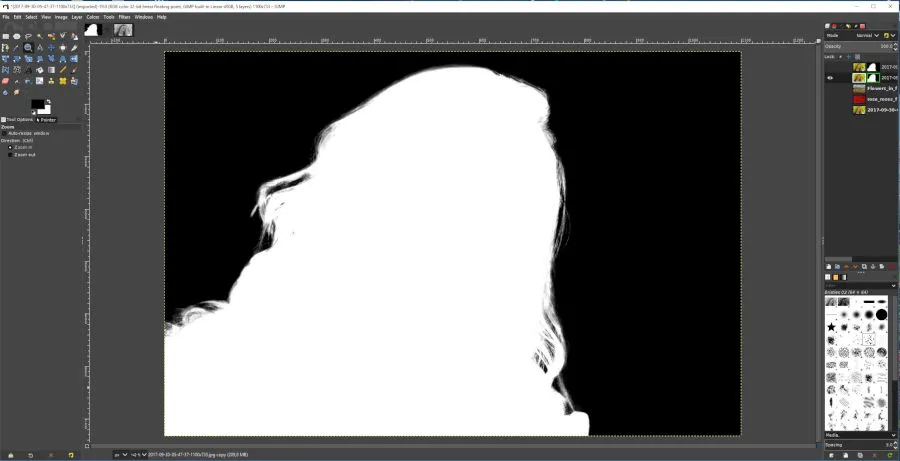
The finished, already inverted mask!
Now we can right click on the mask, and select "selection from mask". Then click on the first duplicate of the original color layer of the girl in the layers panel, then right click it and select "add alpha channel" in order to add transparency to the layer. Right click that layer again and select "add layer mask", and choose "from selection"; we will now have an exact copy of the layer mask we created on the color photo, cutting out the girl and making the background transparent.
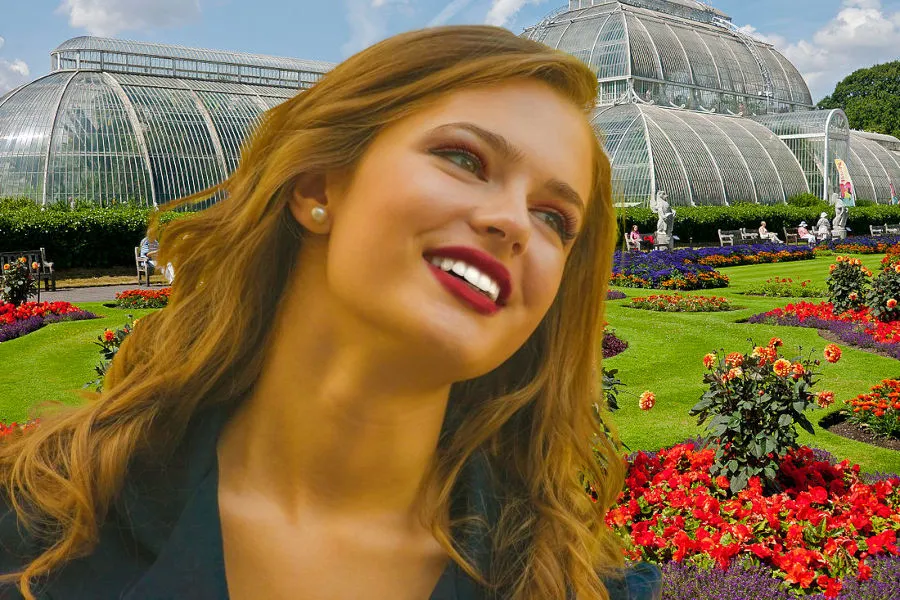
All that's left now is to paste in any background we want and go on with fine-tuning the colors and color balance to make the two images blend together even better; the work done on the cutout already add a lot to the realism of the collage, even when it's obvious that I need a lot of practice still:
The final result; our girl against an alternative background. A lot of tweaking is still needed as the greenish fringes need to be camouflaged more, and some of the strands of hair end a bit too abruptly...
There's still a lot to be done to make this better; take more care in creating the mask, and applying a slight "gaussian blur" filter to it to make the edges of the selection softer, making it blend in more with the background. Color correcting the green fringes by specifically selecting them and changing the hue to take out green or add red... But I'll leave that for another time. This was just to try it out in GIMP, and to hopefully give you all a basic idea how the method works.
Thanks so much for visiting my blog and reading my posts dear reader, I appreciate that a lot :-) If you like my content, please consider leaving a comment, upvote or resteem. I'll be back here tomorrow and sincerely hope you'll join me. Until then, keep steeming!

Recent articles you might be interested in:
| Latest article >>>>>>>>>>> | Elvis Lives! |
|---|---|
| Austerity: A Mental Pitbull | When Fiat Finally Falls |
| We Don't Need No Stinking Badges! | Steem's Bright Future |
| Plants' Social Life | I'm Going To Learn GIMP |
Thanks for stopping by and reading. If you really liked this content, if you disagree (or if you do agree), please leave a comment. Of course, upvotes, follows, resteems are all greatly appreciated, but nothing brings me and you more growth than sharing our ideas. It's what Steemit is made for!

Just for Full Disclosure, I'm invested in these crypto-currencies:
Bitcoin | Litecoin | EOS | OmiseGo | FunFair | KIN | Pillar | DENT | Polymath | XDCE | 0x | Decred | Ethereum | Carmel | XYO
@helpie is a WITNESS now! So please help @helpie help you by voting for us here!