
It was a while since I wrote my last STEM post, so if you are visiting my blog, you probably have to search deeply under all those translation posts in order to find it. I hope that you haven’t already forgot me.
What has been changed in a meanwhile in my life?
- I finished my college, so now I have my BSc diploma!
What else?
- Ummm... not so much. I drink rakia every other night with my friends, since I don’t have much smarter things to do and I have a couple ideas for future to earn some millions. Just some regular things.
Today I just felt some kind of nostalgia, because I haven’t written some serious post for a long time, so I wiped dust from my keyboard, warmed up my fingers and came up with one interesting topic.
I know that there are a lot of photography fans here on Steemit, so I guess that they can be curious about this.
I bet that you love optical illusions, am I right?
Then you should take a look at the picture below. Maybe you saw it earlier somewhere on the internet, because it’s pretty known.
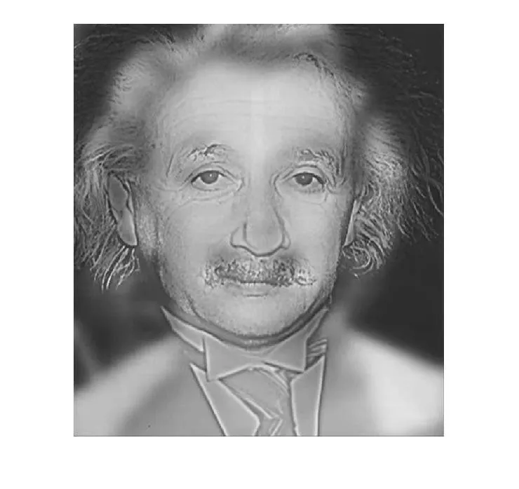
The thing is that if you look at this picture from a short distance, you can see one familiar face. That’s right, you can see Albert Einstein (you don’t know much about him? Oh, you must check my first article on Steemit) .
If you look at this picture from a long distance, or simply zoom out the picture or lose your focus and try to watch blurred, you can see another familiar face – Marilyn Monroe. Take a look:

Okay, it’s 2019, so probably you are not impressed by this. But have you ever asked yourself how is this possible or how is such illusion made?
In order to show you that, I have first to explain one very important term:
Fourier transformation
This transformation is one super powerful tool for signal processing.
How?
Every complex signal can be written as a combination of simple, sinusoidal signals and every sinusoidal signal has its own frequency. Using this transformation, we can see those components for each complex signal and we can work further with them. When we can see on which frequencies are the strongest components, we can do for example some filtration, if it’s needed and so on. So, basically Fourier transform is doing mapping of a signal from spatial domain into frequency domain. To be clearer, take a look at this great gif below, to see how it looks like:

Author Lucas V. Barbosa, Public Domain
I think it’s much more understandable to look at that gif, instead of looking at this formula:
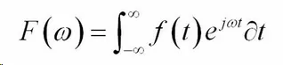
Which is, in fact, the way to do this transformation.
Maybe you are asking yourself – what is the relation between this and the image processing? Well, I’ll reveal it to you – every picture can be viewed as a signal in two dimensions! Basically, we have 2D signal and by applying 2D Fourier Transformation, we can see its spectrum (a.k.a. components in a frequency domain).
When image is decomposed into its components in frequency domain, we can see some information about geometric characteristics of the picture, or to try to remove noise from the image, or to sharpen it and much more. Everything is done in frequency domain.
For example, take a look at this picture below:

Now if we do its Fourier transformation, we will get something like this:

It has 3 components, where the component in the middle is the direct component and it has an information about mean gray value of an image. If we look at the image again, we can see that it has only two colors – white and black, so the other two components corresponds to the frequency of those black and white stripes.
Why they all lay on one horizontal line when lines on image are vertical?
Because, if we look again at the image, its intensity will change the most if we go horizontally through.
Often, Fourier transformation has a huge range, as you can see that the major of the transformation is shown black and you can see only 3 small dots. In order to see better smaller components, it’s often done some logarithmic scaling and I will show you how it looks like later on the optical illusion.
Now, let’s get back to this Einstein-Monroe thing.
First of all, I’m going to turn on Matlab and read this image, using this code below:
Now let’s do Fourier transformation in order to see spectrum of the image:
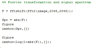
Here is the result:
Maybe you can’t see it, but there is one really, really tiny white dot in the center of this image. This is exactly why we are using logarithmic scaling, which I mention several paragraphs above. Unless you have some Superman eyesight, you probably won’t see anything here. Now, when we scale it, the spectrum looks like this:
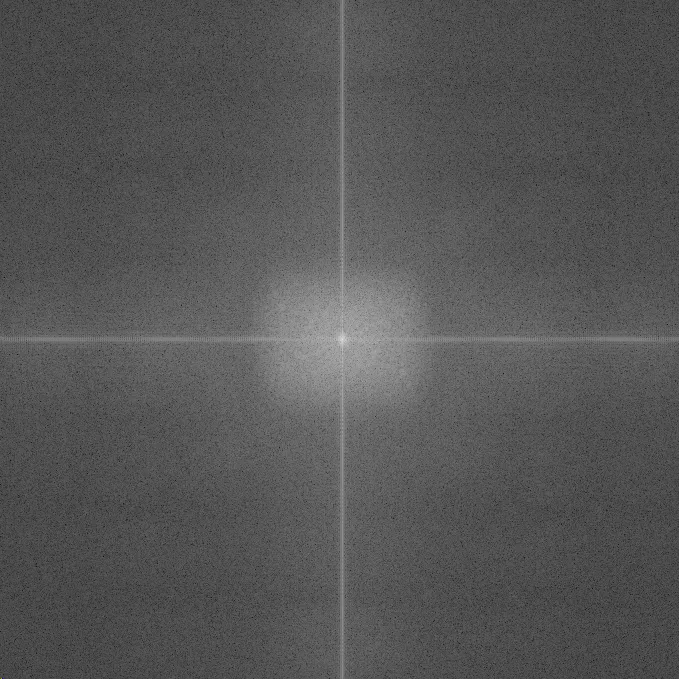
It’s much clearer now isn’t it?
You can see that there is one highlighted small circle in the strict center, while around is an area which is less highlighted. Those two areas are two sets of components which correspond to two different pictures.
Fun fact – components on the higher frequencies are the ones which give sharp look to picture, and components on low frequencies are responsible for that smooth and blurred look.
So when you are looking outside at some object far from you, you see actually lower frequencies and that is why you can see blurred silhouette of a man on a 1000m distance, but you probably can’t read what is written on his shirt. Same thing with the higher frequencies – you can see them when the object is near you, so if that man from a 1000m distance would stand right in front of you, you could see almost every detail on him.
And that is exactly how this image is made – Marilyn Monroe contains only components on the lower frequencies and Einstein contains only components on the higher part of the spectrum. So, those two areas are put together in frequency domain and in spatial domain it turned out to this illusion.
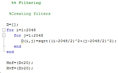
Now, let’s try to separate those images.
We’ll create two filters – one low pass with radius of 20 pixels and one high pass which will pass through every component which distance is more than 20 pixels from center.
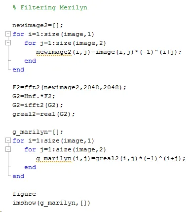
Now we are filtering Einstein:
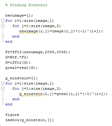
And now it’s turn for Marilyn:
And here are the results:
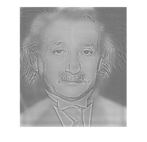
And

As we can see, Einstein was on some higher frequencies than Marilyn Monroe (oh what a metaphore), so the first picture is much more sharpen than the second.
And that is the explanation of this optical illusion for nerdy part of the public.
I hope that you enjoyed.
Daily Fun Fact - For all photography lovers, here is one cool article on which I ran up to on my FB feed, completely unrelated to this post: https://www.artfido.com/a-19-year-old-student-hides-spy-camera-in-his-clothing-to-take-secret-street-photos-in-the-1890s/
Until next time,
Nikola
Sources:
Wiki Fourier Transform
This cool article abou image processing
Good part of this article is written based on my experience
The original picture of optical illusion is taken from Flickr and it has public domain, so I changed it further to be grayscale image.
All other images are generated by me and are free for further use.