Steemit is an amazing network, no question about that. If you're here and active I'm preaching to the choir.
When something is as open to possibility as Steemit is it saddens me to see the evolution missing so many tweaks.
Don't get me wrong, in my short time here I've learned that there's constant growth and many amazing people working very hard to bring remarkable changes with the many DApps. It's a whirlwind just trying to keep up with the diversity of Steemit.
That said, I feel that the interface of platforms (at least for mobile as that's how I navigate the network) could use a MASSIVE rehall.
Here's a list of the things that have surfaced in my mind while being here:
Favourite Organization
For example:
- Read later
- Steemit Information
- Poetry
- Friends- or something identifying those that we interact with frequently @riverflows @steemityourway @lenspirational @empress-eremmy
- Supporters- the @helpie and @steembasicincome @toofasteddie @bluengel @heyhaveyoumet @upfundme @roger.remix
- Supportees (yes, I'm that person who creates her own words)- @iamjustified @lucnez @hollywoodmovies @activebeast
- Contests @naturalmedicine @flamingirl #summercontest @dtube @freedomtribe
- Fitness, sports, games, charity etc.
Layout
Currently, when I hang out on someone's personal Steemit living space ("page") what I do is scroll, scroll, and...
There's no placement. No organisation. I feel like I've walked into a home that has a entry way and then one narrow and forever long space filled with the kitchen sink, clothing, dinner, every person they know, a bed, and unfolded laundry on the furniture (I might be talking about my actual living room now).
I would really like to be capable of placing what I want where I want.
For example:
- The main area: where one presents what they chose; personal writing or an amazing resteem. This is our main area to DISPLAY what we wish to be most apparent.
- A sideline: where we have certain things in a nice little space. Perhaps this is where all the reesteems go or food related posts. Maybe we want to keep our dark rants quietly on the side and the positive content in the viewers face.
- Highlight Area: "Here on the lovely left side in the upper corner I have for you some amazing writers that I highly recommend to you" Did you read that in my fancy pants presenter voice? No? You must read that again dear friend 😄. I think of this section to be somewhat like those website "links" ... but, a modern high breed.
- Photos: or a photo... or something. We have a network that is just oozingn with artists of many types yet, our "home" looks like an airline schedule screen- and the flight is "delayed"
- Social Network Connection: come on!!!! I should be able to go to @taskmaster4450's "house" and be capable of IMMEDIATELY seeing and clicking on all of their internet world addresses (if they were to share that information) Why is this not already a thing?
- Following improvement. I'm following these people so why are they hiding under a single word; "Following". Yes, I'll see them in the feed... maybe. Or, maybe the feed gets over run by a couple other amazing creators and the little guy gets lost in the scrolling race. Followers should be displayed better and have better accessibility so that we can check in on their great content easier and are more able to help out.
- A priority option. Facebook has an option to "always show first" - to always present chosen people to be highly viable in the feed. This would be very helpful for those that we are essentially mentoring and encouraging.
I think that what I'm visualizing is similar to a magazine yet, NOT a magazine. Not Facebook. Not Twitter.
An intelligent perspective would be to look around and get inspiration from the entire media world and put together something that has proven to be functional yet make it BETTER. Steemit HAS the ability to be the Goddess 😉 of tech networks.
I'm no programmer, I'm a visualizer (as you can see)- I'm not the person who has skills of any kind to create this vision. 🎶is there anybody out there?🎶 - Pink Floyd
I apologize if there's something that I'm unaware of that essentially renders my vision ridiculous. I am new and I'm that person who thinks they can improve everything; or, visualize 🎶a whole new world🎶 - Tim Rice / Aladdin.
Much love. 💕💕💕💕💕
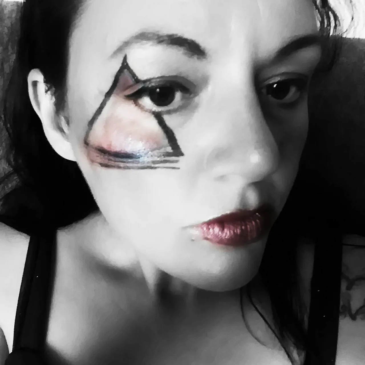
Here's a photo because I don't want to be a hypocrite... lol
