
Earlier this week the UK Office for National Statistics (ONS) reported a lack of increase in life expectancy over the last three years, and even a decrease in life expectancy in some areas of the country 1. This is the first occurrence, since records began, of a three-year period where life expectancy has failed to significantly increase. A statistic that if it were to become a trend, would run counter to a history of continuous health progress in the UK that dates back over 200 years to the birth of modern medicine. Title image credit: Pixabay
Putting the recent life expectancy data in perspective
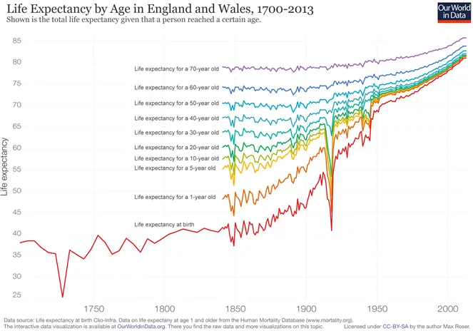
Before the 19th century, there was little or no long-term life expectancy trends. The average life expectancy consistently fluctuating around the 35 – 45 years-of-age mark and, generally speaking, it was a pretty awful time to be alive (but that’s ok, at least it was over relatively quickly!). From the end of the 19th century, however it was clear that progress was starting to build, as each year often saw life expectancy in the UK increase compared to the year before.
The rate of increase was slow at first, but then proceed to increase dramatically as we entered the 20th century. It increased to such an extent in fact that a child born in 2013 had an expected lifespan double that of a child born 150 years previously 2.
The graph below shows how improvements in health of children less than 5 years-of-age largely fuelled this development. However, in the last few decades even those that made it past childhood have seen substantial life expectancy increases.
This week’s report from the ONS suggests that between 1982 and 2017 life expectancy in the UK has risen 7.9 year for men and 5.8 years for women, giving them a life expectancy of 77 years-of-age and 81.1 years-of-age respectively 1.
To put this another way, it’s possible to convert these increases into a number of weeks or months of extra life gained each year.
This is the approach that the ONS takes when reporting the data.
Every year they report yearly gains in life expectancy and reports them as three-year averages, so as to avoid anomalous events such as the N1H1 flu pandemic of 2010/11 throwing off the statistics (i.e. this year the data from 2015-2017 came out, last year the data from 2014-2016 came out). When plotted by year this is how the rate of change in life expectancy looks for the UK as a whole since the 80’s:
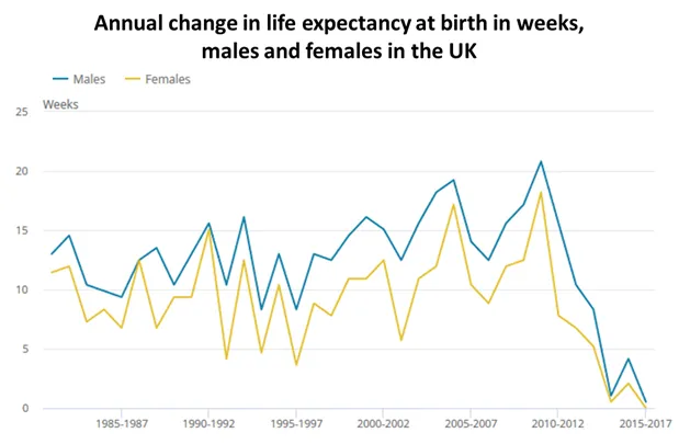
With the increase in life expectancy at, or near, zero-weeks for the last three year period it has been suggested 3 that health progress has now staled, and worryingly there is no reason why this trend has to stop at zero.
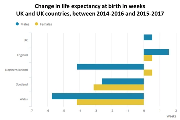
These findings are perhaps most stark when life expectancies are compared across the four countries that makes up the UK (yes, sorry the geography of UK can be confusing sometimes). The graph below demonstrates how the change in life expectancy is not homogenous across the UK. It has in fact declined in Scotland, Wales and Northern Ireland (for men) while it slightly increasing in England, averaging out to a near negligible gain for the UK as a whole when weighted by population size.
With current cancer survival at a record high 4, smoking rates at an all-time low 5, and medical technology continuing to storm ahead, this trend reversal is a confusing and potentially worrying statistic to see occur.
Similarly to economy growth, we have become accustomed to seeing continuous improvement in health. As of now, however, we may be heading into somewhat of a “medical recession” whereby for the first time since the advent of modern medicine young people within the UK are predicted to live shorter lives than their parents.
While this effect appears most starkly in the UK and the US data (mostly due to the opioid crisis in the US it would appear, but that’s a post for another day). A similar slowdown is evident across a number of other high-income countries 6.
Have we hit the hard cap of life?
So, does this mean we’ve hit a point where we can progress no further with life expectancy?
While, some have argued that we have an absolute lifespan for which we will likely not pass 7, it is highly unlikely we have hit that point just yet for a couple of reason.
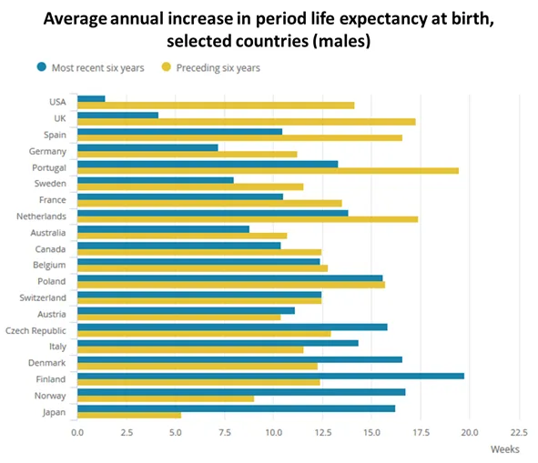
Firstly, other countries have been able to achieve further life expectancy gains. Take Japan for example where their average life expectancy for women is 87 years-of-age, and as demonstrated in the graph above, they do not appear to be experiencing a similar slowing in their life expectancy improvement.
Secondly, the rate of life expectancy increase dropped off dramatically here in the UK, far quicker (only over the last ten year) than we would perhaps expect if we hit some sort of hard cap.
What is this then?
Well the best-case scenario is that this is a statistical anomaly; we’ll collect the data again over the next few years and life expectancy will continue to increase again.
However, if the latest findings in the ONS report are not an anomaly, and continue to drop, there appears to be three, likely interacting, theories for this levelling off and reduction in life expectancy.
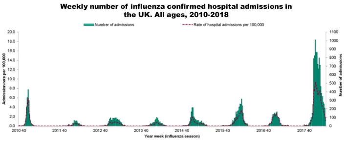
1. Bad flu season
While the ONS life expectancy data is published in chunks of a few years, so as to reduce the effects of fluctuations in seasonal illness such as influenza, it is still possibility that the data can be skewed by such illnesses. With the last season seeing a particularly high rate of influenza cases 8 this could very well explain the findings for this year. However, it would not explain the similar decrease over the preceding years.
2. Ten years of austerity cuts to the health and social services are taking their toll
This trend could be the long shadow of the 2008 financial crises, and subsequent economic recession, continuing to causing ripples across the world. As a reaction to the financial crash, the coalition government that came into power in 2010 put into place sweeping health and social care cuts that left many of the poorest in our society without vital support. This data could be showing those of us that have fallen through the cracks as a consequence. For more on this topic, this long read from the New York Times give some great context for this argument.
Seeing as the slow-down in life expectancy gains also started in 2010 this theory would appear to hold water. However, this factor on its own doesn’t explain why a similar slow-down in Germany, Sweden and the Netherlands has been greater than in Greece, Spain, Portugal and Ireland, where austerity has been most severe 3.
3. Extreme weather events are becoming more common
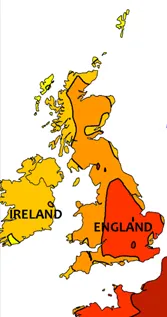
Image credit:
Wikimedia
With average death rates in both summer 9 and winter 10 trending higher in recent years, it could very well be the case that this life expectancy data is one of the first hints of climate changes having a national effect from public health perspective.
A death from climate change is never going to be diagnosed in an autopsy as such, but if we look to data trends this it will become obvious over time.
Far more research is needed to definitively make this claim at this time, although that said there is little doubt that one day we will see the effects of climate change on our public health, even here in the UK 11.
Why does slowing life expectancy increases matter?
In the simplest terms, the reason that this matters to me comes down to these three points:
- People are dying that potentially would not have died if conditions were different.
- When an increase is seen in the death statistics, we can be fairly certain that suffering is also increases at the same time.
- If there were a way we could intervene to prevent deaths and suffering from occurring then we have a moral responsibility to do so.
Truth be told the effect reported by the ONS is currently a mystery, but what it might be is a “canary in the coal mine” type deal for those of us in public health. There are likely many complex interacting factors going on here. What we can do from this point on, however, is start to pick apart this trend and see what factors are likely to contribute the most. This is the benefit of data on this scale, the story is in the data somewhere, we just need to ask it the right questions.
The answer is likely to be complicated but the question is easy:

About me
My name is Richard, I blog under the name of @nonzerosum. I’m a PhD student at the London School of Hygiene and Tropical Medicine. I write mostly on Public Health, Effective Altruism and The Psychology of Vaccine Hesitancy. If you’d like to read more on these topics in the future follow me here on Steemit or on Twitter @RichClarkePsy.
I'm a proud member of @SteemSTEM and you should be too! Find more information about their fine work here

References
[1] The Office for National Statistics: Statistical Bulletin: National life tables, UK: 2015 to 2017
[2] Our World in Data: Life expectancy
[3] The BMJ: Stalling life expectancy in the UK
[4] Our World in Data: Cancer
[5] The NHS: Statistics on Smoking – England, 2018
[6] The Office for National Statistics: Changing trends in mortality: an international comparison 2000-2016
[7] Science Daily: Maximum human life span has already been reached
[8] UK Government Official Statistics: Flu annual report: winter 2017 to 2018
[9] The Guardian: Deaths rose 650 above average during UK heatwave – with older people most at risk
[10] The Office for National Statistics: Excess winter mortality in England and Wales: 2016 to 2017 (provisional) and 2015 to 2016 (final)
[11] The Lancet: The Lancet countdown: Tracking progress on health and climate change